Pang Tun Yau
A seasoned tech journalist who now focuses on his other passion, Pang is a firm believer in old-school DCA and optimised spending.

21st January 2020 - 6 min read
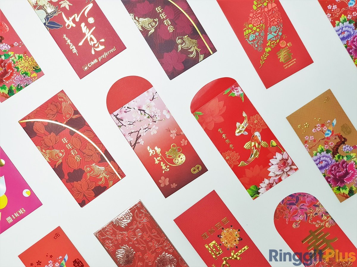
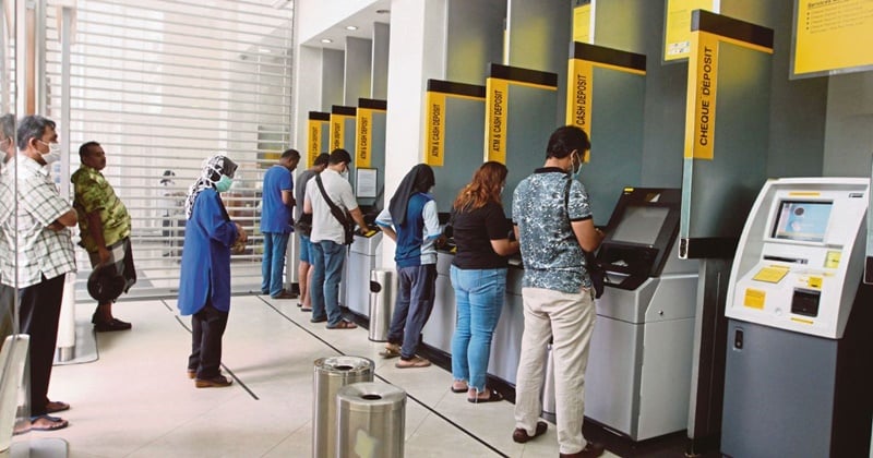
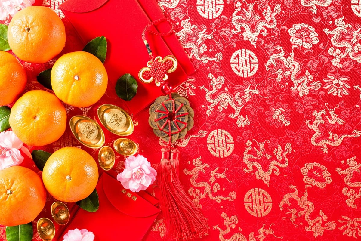
The young ones love them. The grown ups collect them. Whether you are a recipient or a giver of them, ang pows are a cultural staple during the Chinese New Year festivities.
Unsurprisingly, in the last decade or so, retailers, malls, and of course, banks have turned the tradition of ang pows into a little competition – who can create the best-looking ang pow? It’s not just for bragging rights, of course – here’s a medium which, if used right, can be a powerful branding tool. If your brand’s ang pow is unique/looks great, they will more likely be used more often – better than going viral!
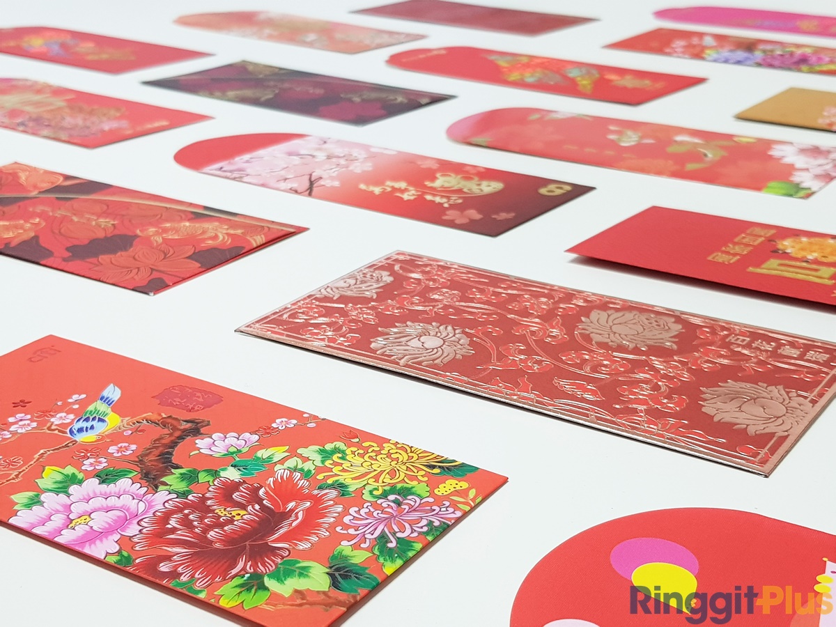
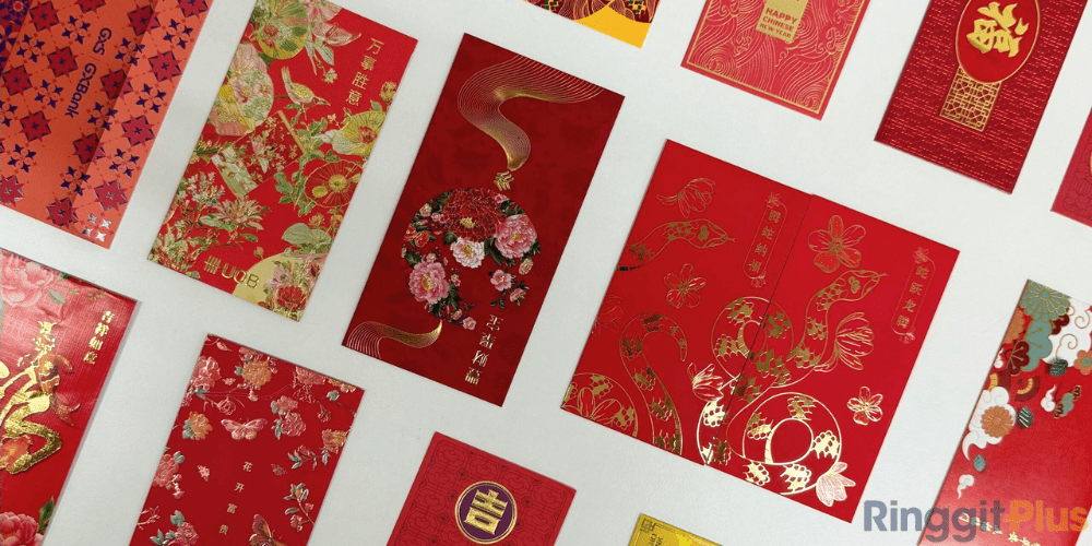
So, which bank has the best-designed ang pow for CNY 2020? With great labour we collected the ang pows from (almost) all the banks in Malaysia which offer them, and our 3-man panel of severely underqualified judges from the RinggitPlus editorial team sat down and gave our critique. Let’s go!
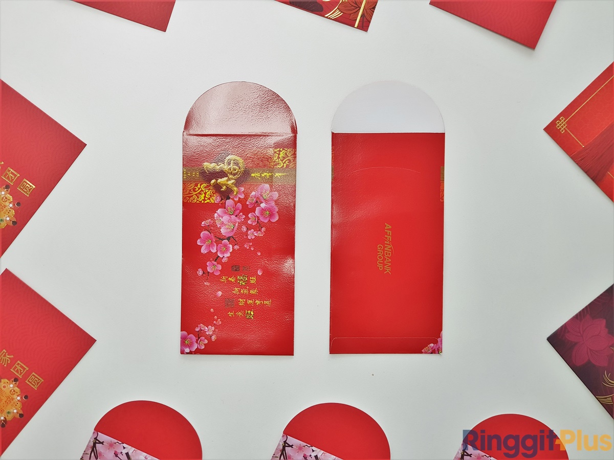
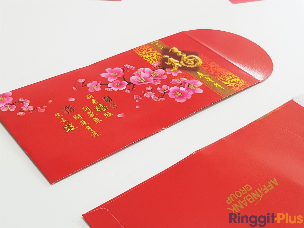
An ang pow that folds at the top, but with a sideways design. Add to that a motif that looks like it was taken from a stock photos site makes Affin’s ang pow for this year rather bland. One star.
HUAT meter: H
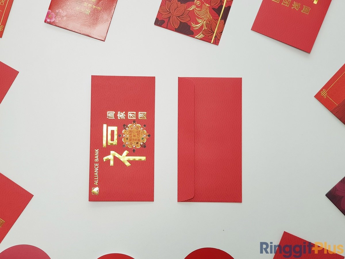
At first glance Alliance Bank’s design looks simple and unobtrusive, but a closer look shows this ang pow design has a lot to offer. From the cute reunion dinner motif to a hidden QR code for DuitNow transfers, it’s a solid effort from Alliance. Two and a half stars.
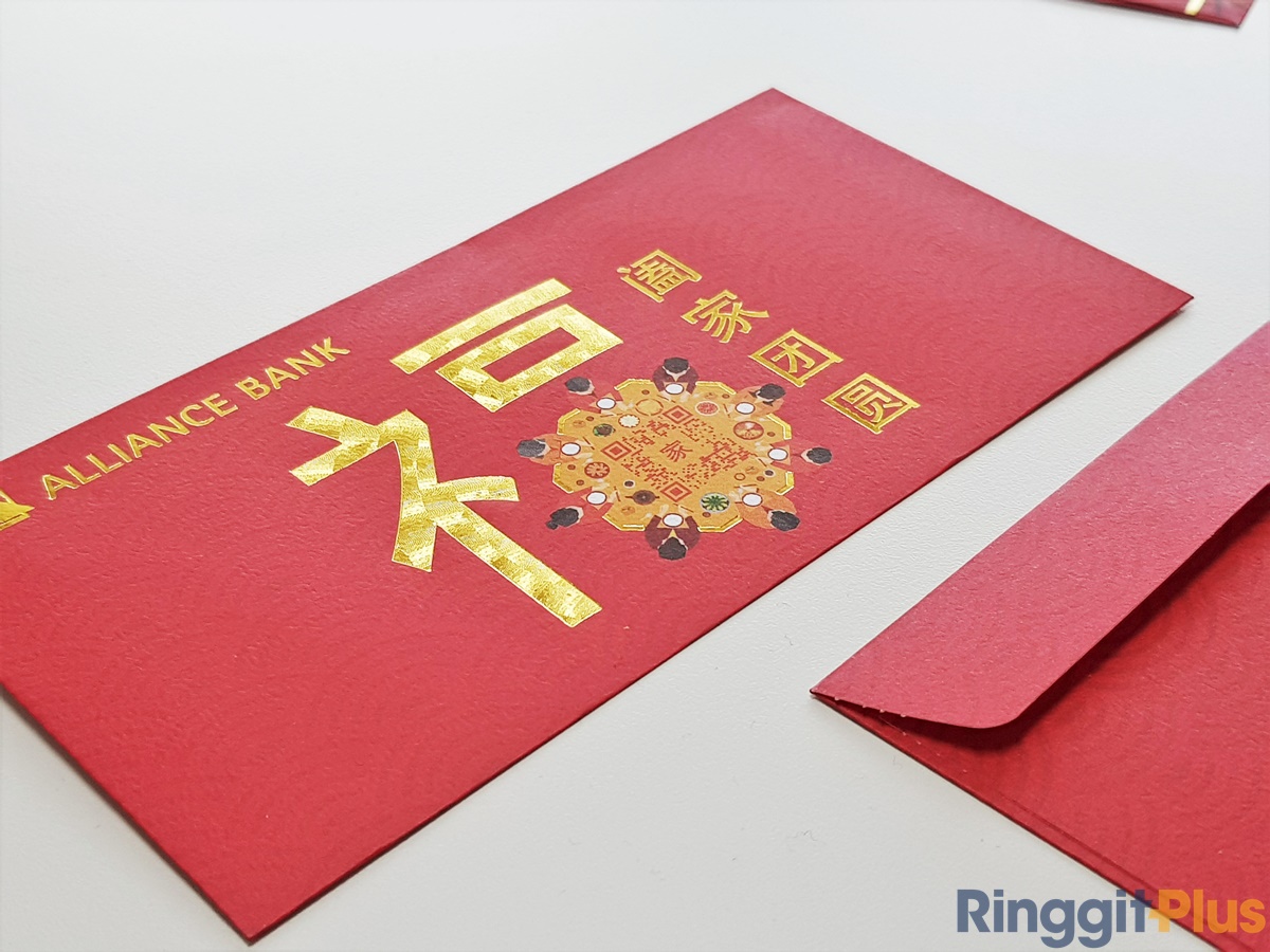
HUAT meter: H U.5
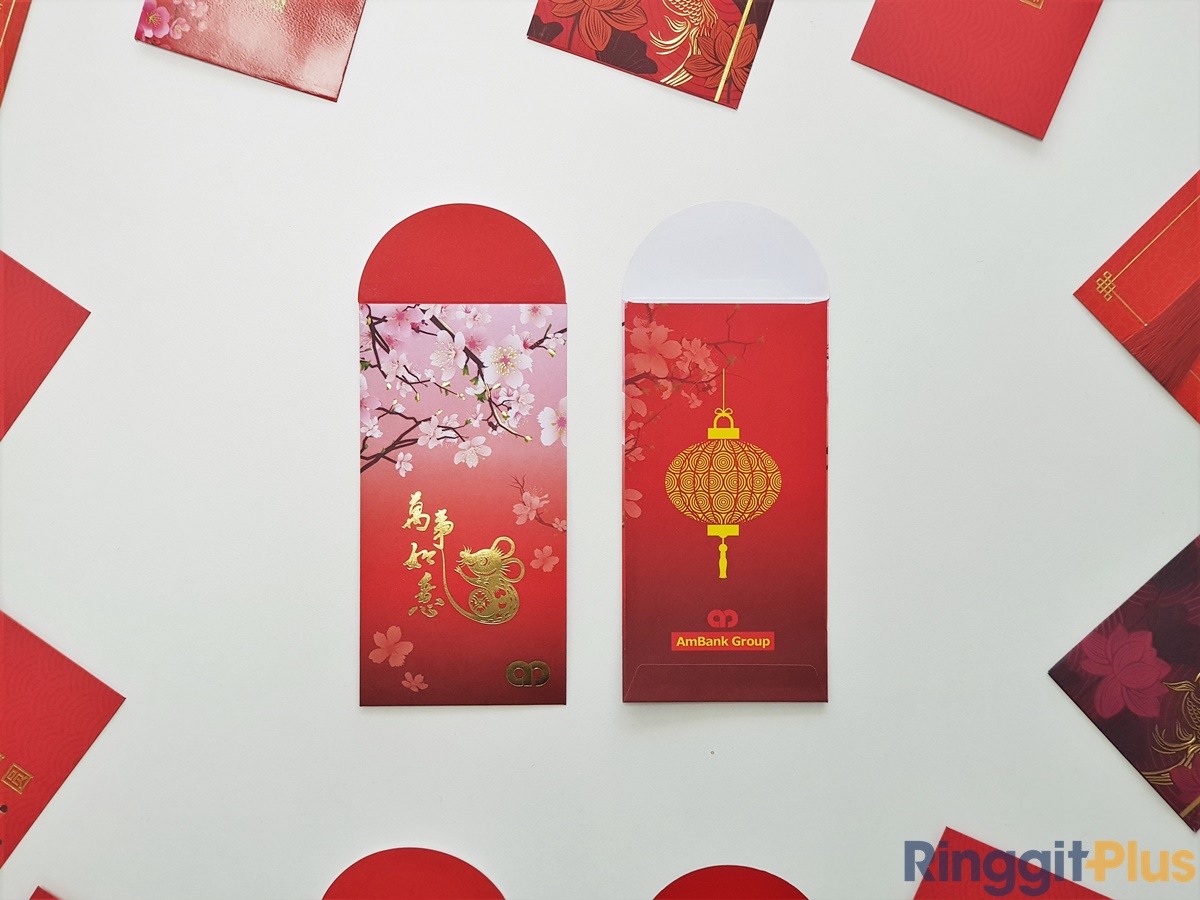
We really like AmBank’s colour choices for its ang pow design this year. With a unique gradient colour scheme, the rat painting auspicious words with its tail, and the serene white flowers at the top, AmBank’s ang pow certainly stands out. Three stars.
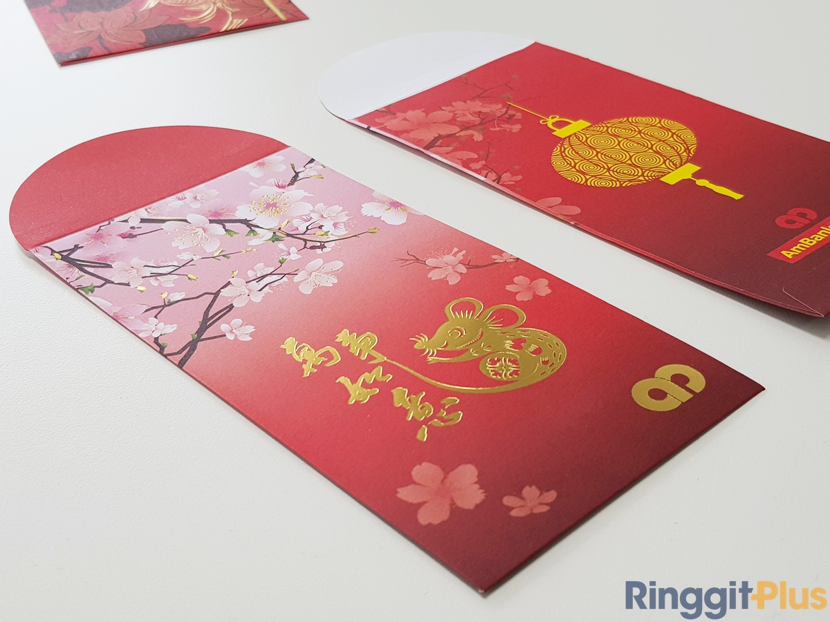
HUAT meter: H U A
The kind of ang pau one would use to decorate the house with, thanks to the gold paint around the flowers and auspicious words printed on the front and back. Two stars (because we can use it for other purposes).
HUAT meter: H U
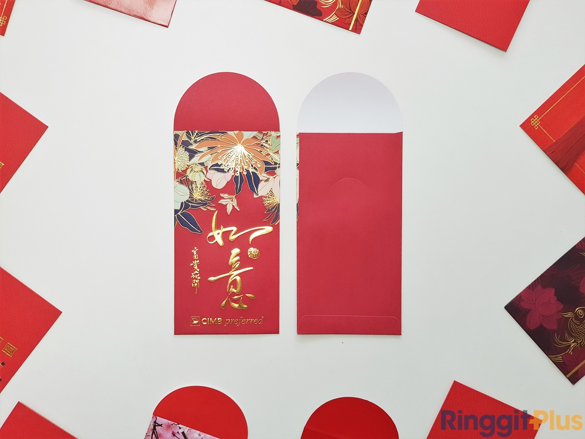
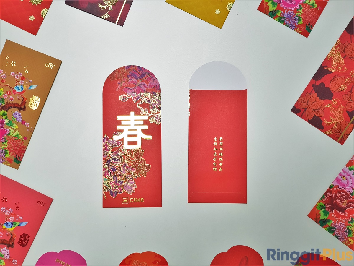
With a darker red tone, CIMB Preferred’s ang pow looks classier than the conventional banking variant. An interesting use of blue hues in the flower motif gives it a distinctive look among this year’s ang pows. Two and a half stars.

HUAT meter: H U.5
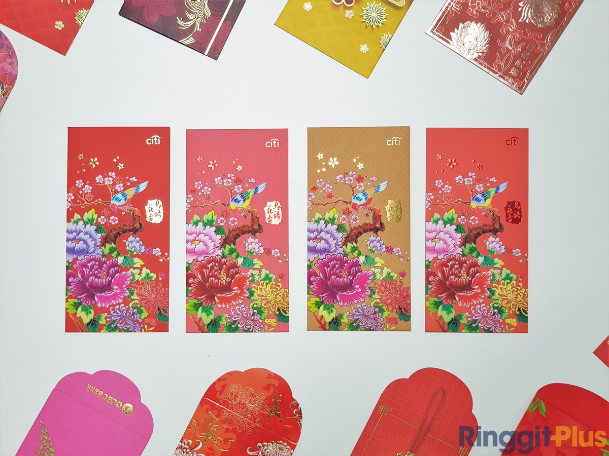
One could almost accuse Citi of cheating, thanks to a huge four-colour option for this year’s ang pow design. Available as a pack of red, pink, peach, and gold packets (two per colour per pack), the colours further bring out the vibrancy of the ang pow design, which nicely straddles the line between modern and timeless. Three and a half stars.

HUAT meter: H U A.5
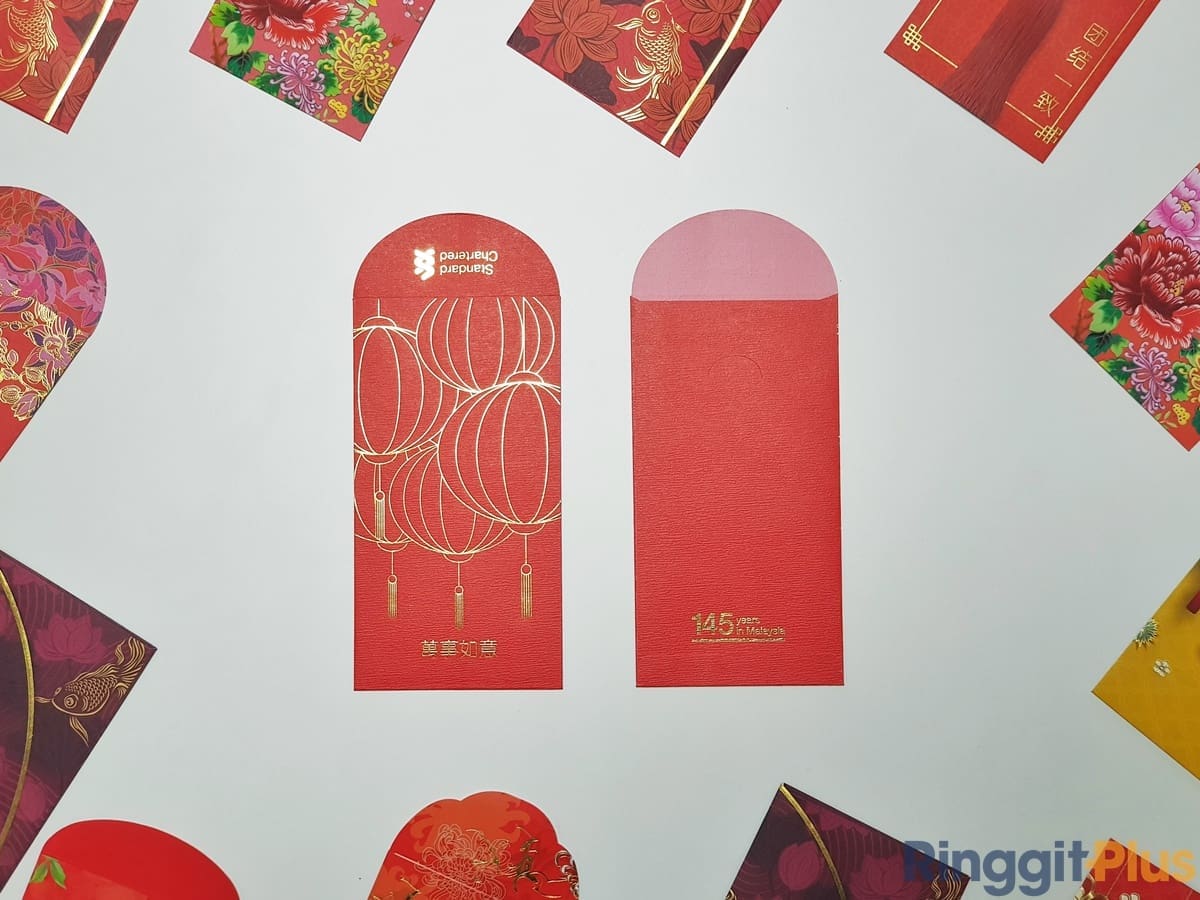
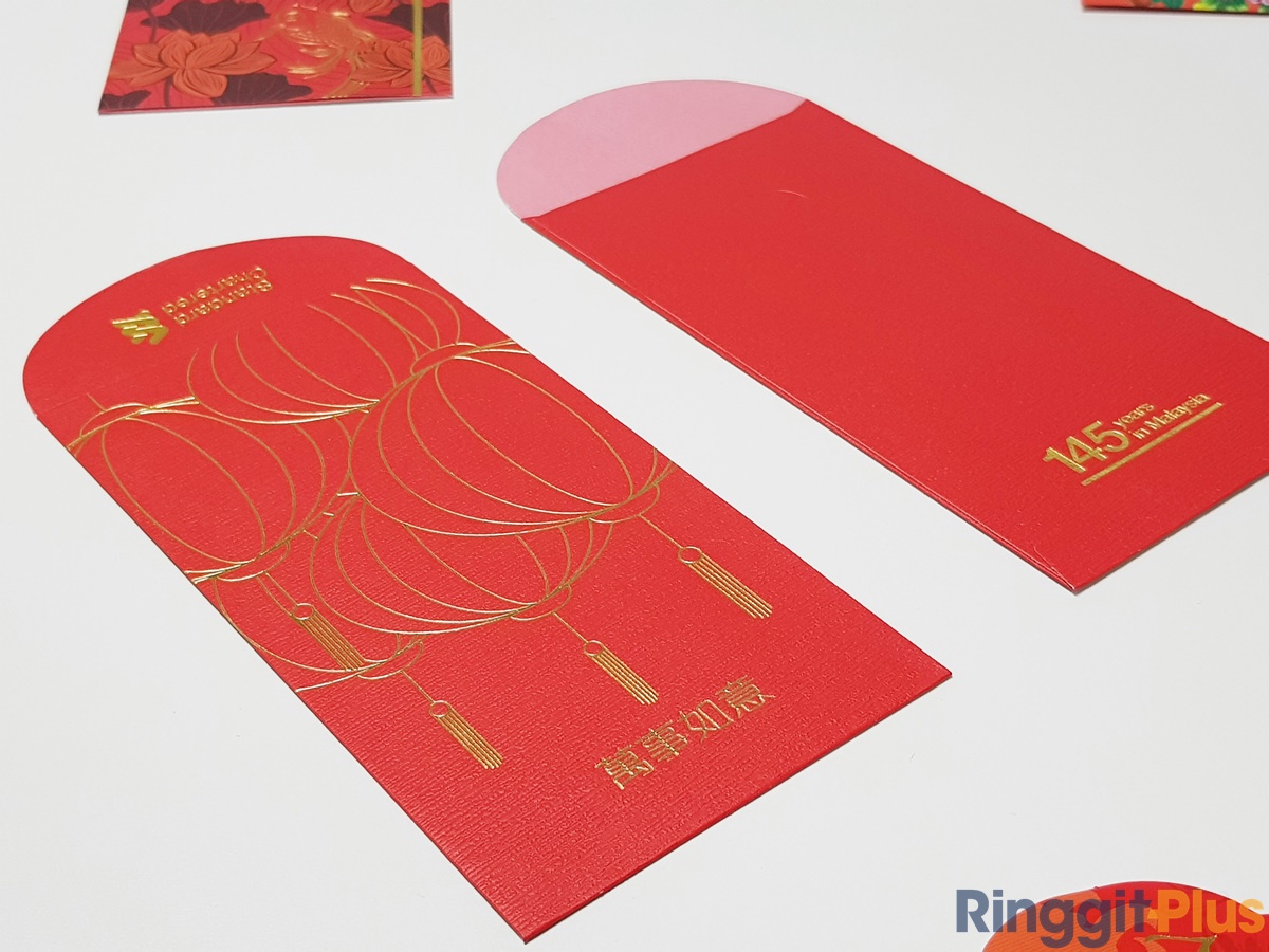
Available in two colours (red and deep purple), it’s the only bank ang pow that folds on the side (vs the traditional top). We like the gold highlight along the fold. Classy, and made from thick paper. Three stars.

HUAT meter: H U A
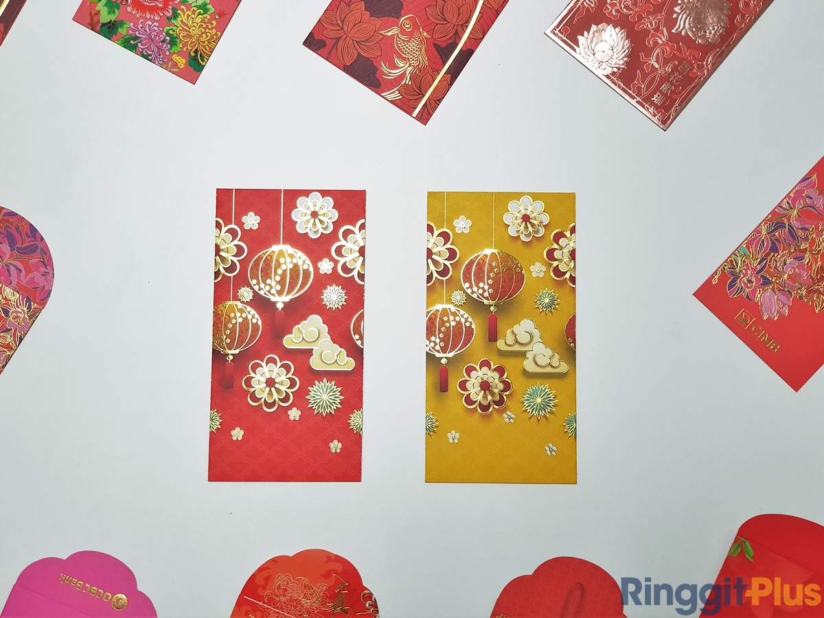
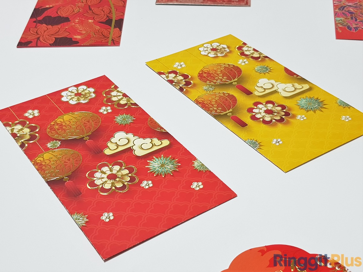
We’re not sure what HSBC is going for with its 2020 ang pow design. There are Chinese lanterns, there are clouds, there are flower motifs, and they all have some 3D effect that didn’t really work. Also, points deducted off the HUAT meter for having so much empty space at the bottom, and virtually none at the top – it’s driving our OCD crazy! One star.
HUAT meter: H
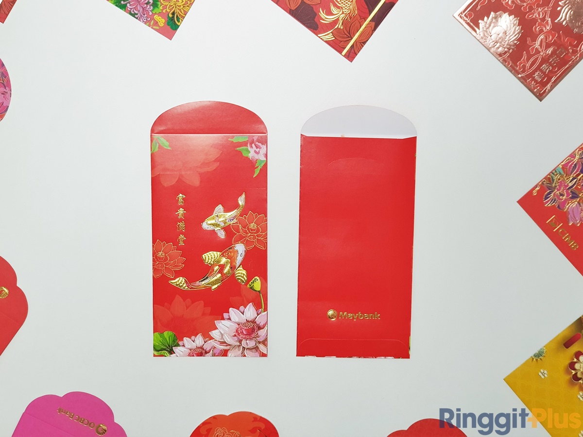
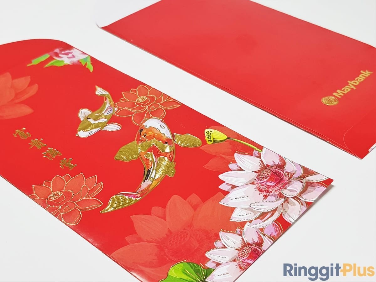
We’re probably spoilt by some of the better ones in this list, but while it’s not exactly ugly, Maybank’s serene take for this year doesn’t really inspire. It’s inoffensive, and doesn’t try to be…anything, actually. One star.
HUAT meter: H
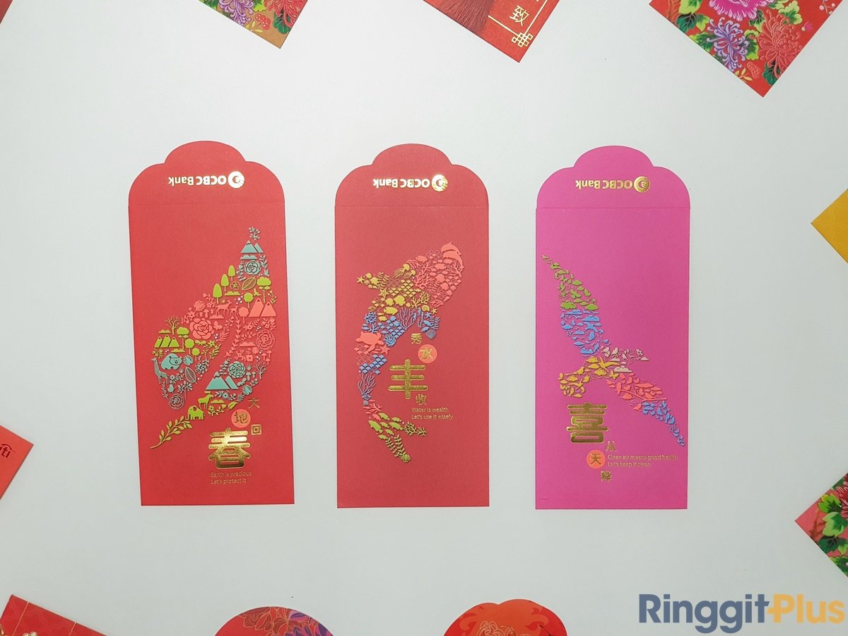
Ang pows with conscience. OCBC’s 2020 ang pow designs offer a reminder of our impact on Mother Earth and the need to conserve it. The two colours both have different designs, but neither of them are actually Chinese New Year-sy. One star.


HUAT meter: H…eal the world, make it a better place…

Oh boy. Flower designs that look like a Tangela. Badly-painted fishes with odd colours. The off-centre Chinese character. This design was one of the few that we unanimously agreed on something. Too bad we agreed that it’s the worst design of the lot. No stars.
HUAT meter: *error*
Another bank that attempted a 3D effect on its ang pow this year, with middling effect. It’s not overbearing though, and the minimalist feel of it actually helps it stand out. Two stars.
HUAT meter: H U

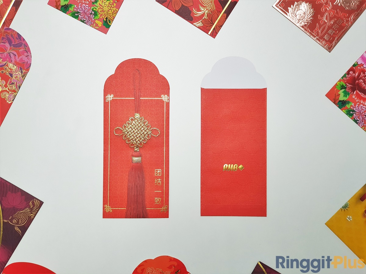
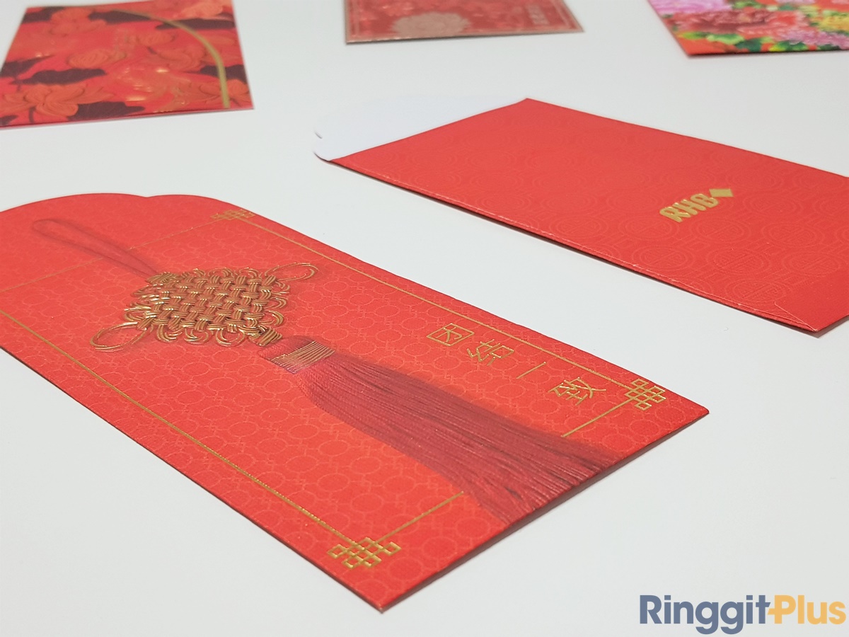
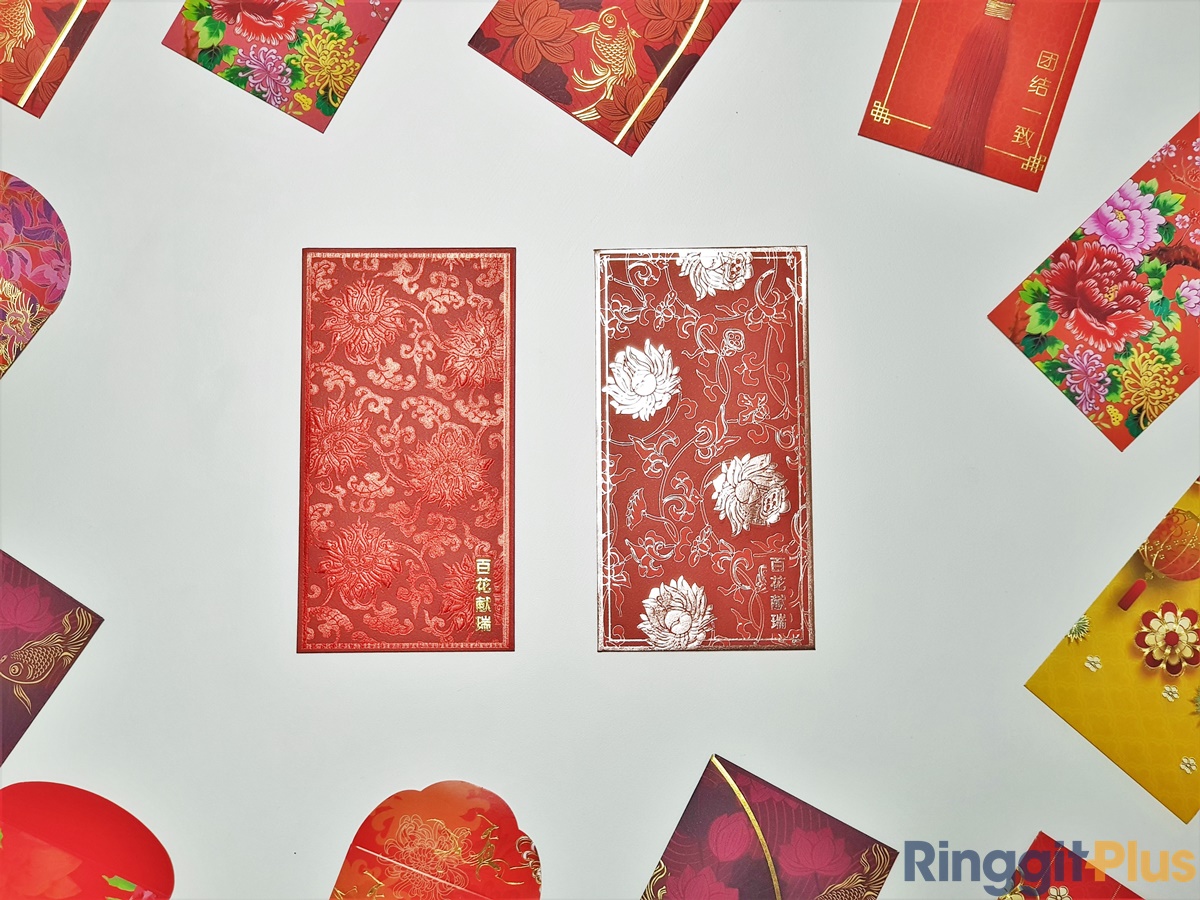
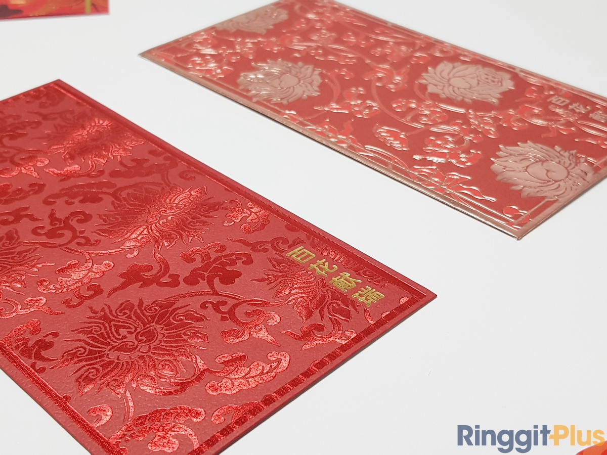
Everybody say it out loud: ex-clu-sive. It’s clear RHB put a lot more effort into its premier banking ang pow designs (they come in two choices per pack), and even includes information on the motif. It’s a premium touch, and we like that there’s a choice between a red-on red ang pow and a cool red ang pow with a muted bronze highlight paint instead of the common gold. Three and a half stars.
HUAT meter: H U A.5
The paper is thick and nice. The simplistic design caused a lengthy debate among us. Is it minimalist? Is it lazy? We can’t decide. Two stars.
HUAT meter: H U
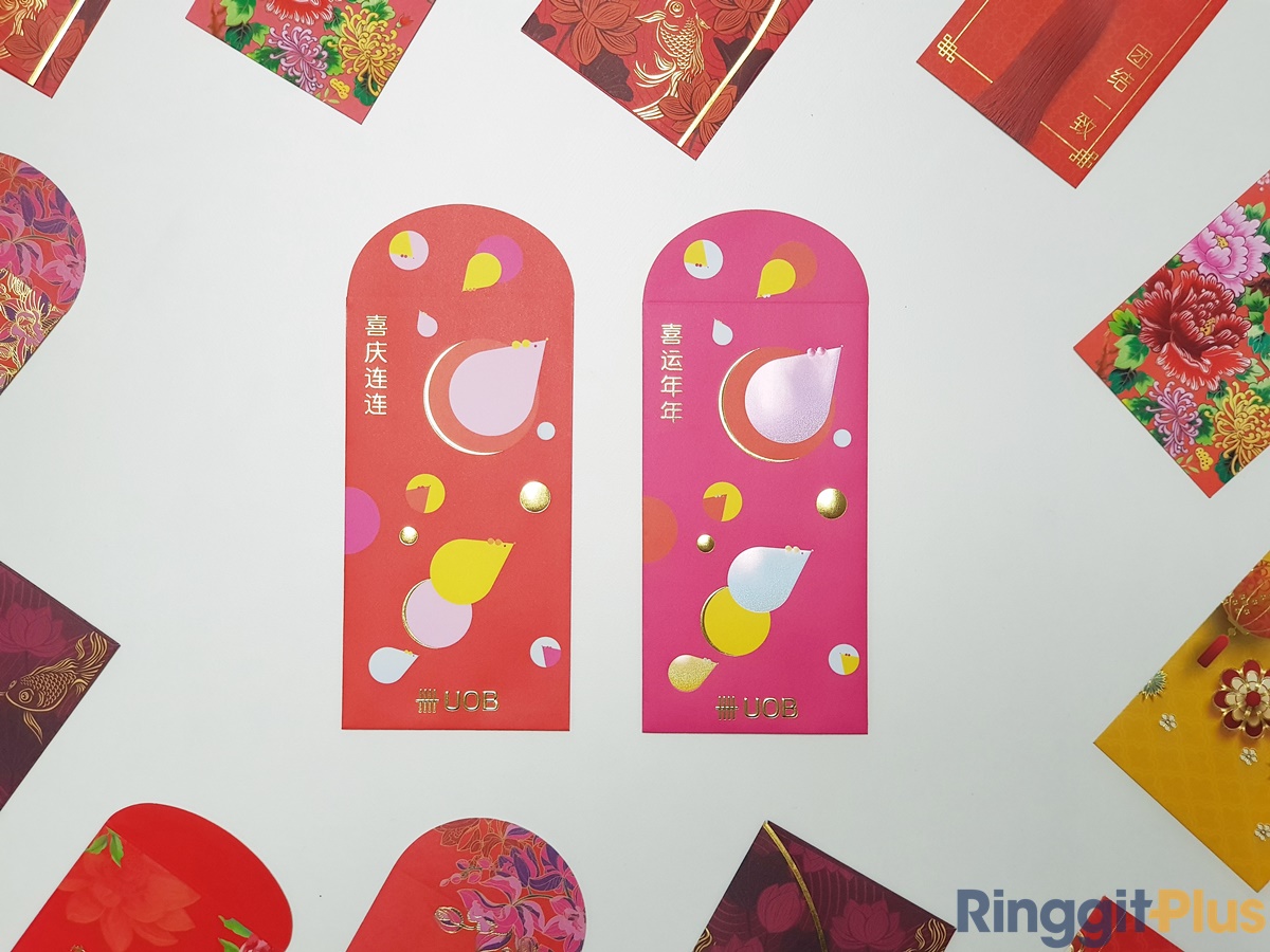
This will not be everyone’s cup of tea, but wow, UOB’s ang pow design for 2020 gave us so much joy. The cute round rat and circular theme is fun and (possibly) a reminder of what will happen if we ate too much during the festive season. The bold pink option is the “special edition” one, and like all special-edition releases, this one’s got a cool sheen on the mice that plays with the light as you move it around. Delightful. Four stars.

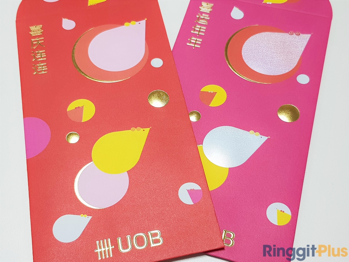
HUAT meter: H U A TTTTTT AHHH
—————-
Disclaimer: the HUAT meter is made up and the points don’t matter. Do let us know in the comments which is the best bank ang pow design for you.
The RingitPlus team wishes everyone a happy Chinese New Year!

A seasoned tech journalist who now focuses on his other passion, Pang is a firm believer in old-school DCA and optimised spending.


Subscribe to our exclusive weekly newsletter and we’ll bring you the week’s highlights of financial news, expert tips, guides, and the latest credit card and e-wallet deals.
Stay tuned for what’s to come next in the personal finance world

Comments (2)
Bank simpanan nasional
CITI