Just when we thought we had finally recovered from year-end feasting and festive chaos, Chinese New Year 2026 comes galloping into view! The snake has gracefully exited the stage, and now the Horse charges in with speed, strength, and undeniable main character energy. Symbolising momentum, resilience, and bold progress, the Year of the Horse feels like an open invitation to move forward with confidence and flair. Can you feel the prosperity picking up pace already?
The Annual Tradition Continues
With a brand new zodiac animal comes a very important responsibility, which is to once again review and rate the ang pow designs from Malaysia’s financial institutions! What started as a fun festive commentary has now become one of our favourite annual traditions, and yes, we take this completely subjective judging process very seriously.
As always, the banks are putting their best hoof forward. Some embrace refined elegance with delicate illustrations and tasteful finishing touches, while others go full throttle with bold colours, dramatic gold accents, and statement designs that practically demand attention at the reunion dinner table. Minimalist chic, maximalist sparkle, symbolic storytelling, and the occasional questionable design choice are all part of the ride.
Introducing The HAY Or Neigh Scale
This year, we are officially retiring the HUAT Meter and replacing it with something far more fitting for 2026. Say hello to the HAY or Neigh Scale!
Here is how it works. The number of Y’s in “HAY” or H’s in “Neigh” determines just how strong our reaction is. The longer the word, the louder the verdict! A simple HAY signals polite approval, while an enthusiastic Hayyyyy means the design is truly racing ahead. If you see multiple HAYYYY repeated, just know that it has officially entered best-in-show territory.
On the other hand, a short Neigh reflects mild disappointment, and a dramatic Neighhhhhhhhh makes it clear that the design has completely missed the track.
Now that the rules are clear, let’s saddle up and see which banks are leading the pack this festive season and which ones might need to head back to the stable for a rethink!
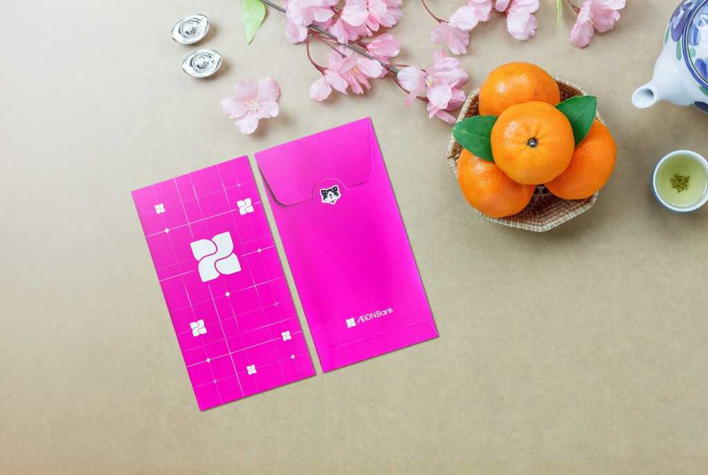
AEON Bank
AEON Bank went with a super clean, hot pink minimalist look this year. It is simple, basic, and very on-brand. The geometric grid lines and logo placement make it feel sleek and corporate, almost like a limited-edition debit card rather than a festive ang pow.
That said, for Year of the Horse, it does feel a little… emotionally unavailable. There is no horse, no festive illustration, no celebratory energy. It could honestly work for any occasion, not specifically Chinese New Year.
And the cat sticker. We understand it is their mascot. We respect brand consistency. But if we are committing to zodiac season, maybe give the cat a horse friend? A tiny festive cameo? A collaborative moment? Right now the cat feels like it wandered into the wrong zodiac year.
Minimal effort, clean execution, but not exactly galloping with festive spirit.
HAY or Neigh Scale: Neighhh
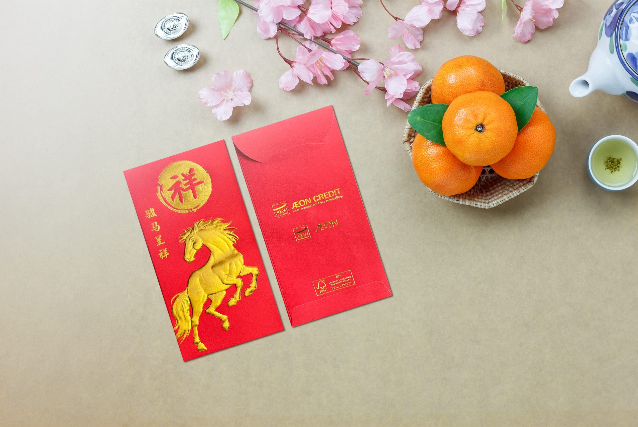
AEON Credit
Now this one is classic. Bold red, strong gold embossing, majestic rearing horse, and a big auspicious character stamped proudly at the top. Grandpa and grandma would absolutely approve. This is the kind of ang pow that feels traditional, respectable, and safe.
Is it groundbreaking? Not really. We have definitely seen similar concepts before. But sometimes you do not need to reinvent the stable. The gold horse is strong, dynamic, and very prosperity-coded. It looks expensive, which is important when you are about to hand someone money.
Not doing too much. Not trying too hard. Solid festive energy.
HAY or Neigh Scale: HAY
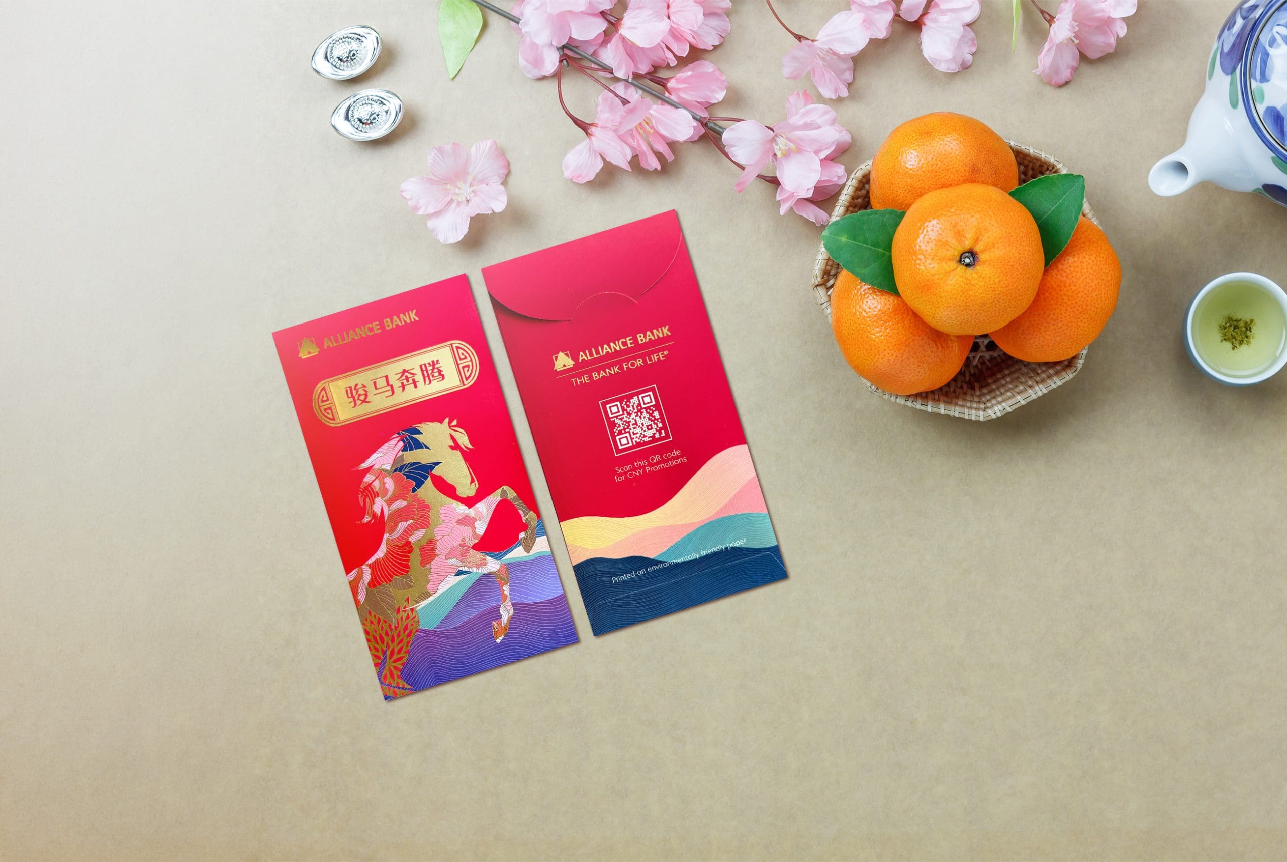
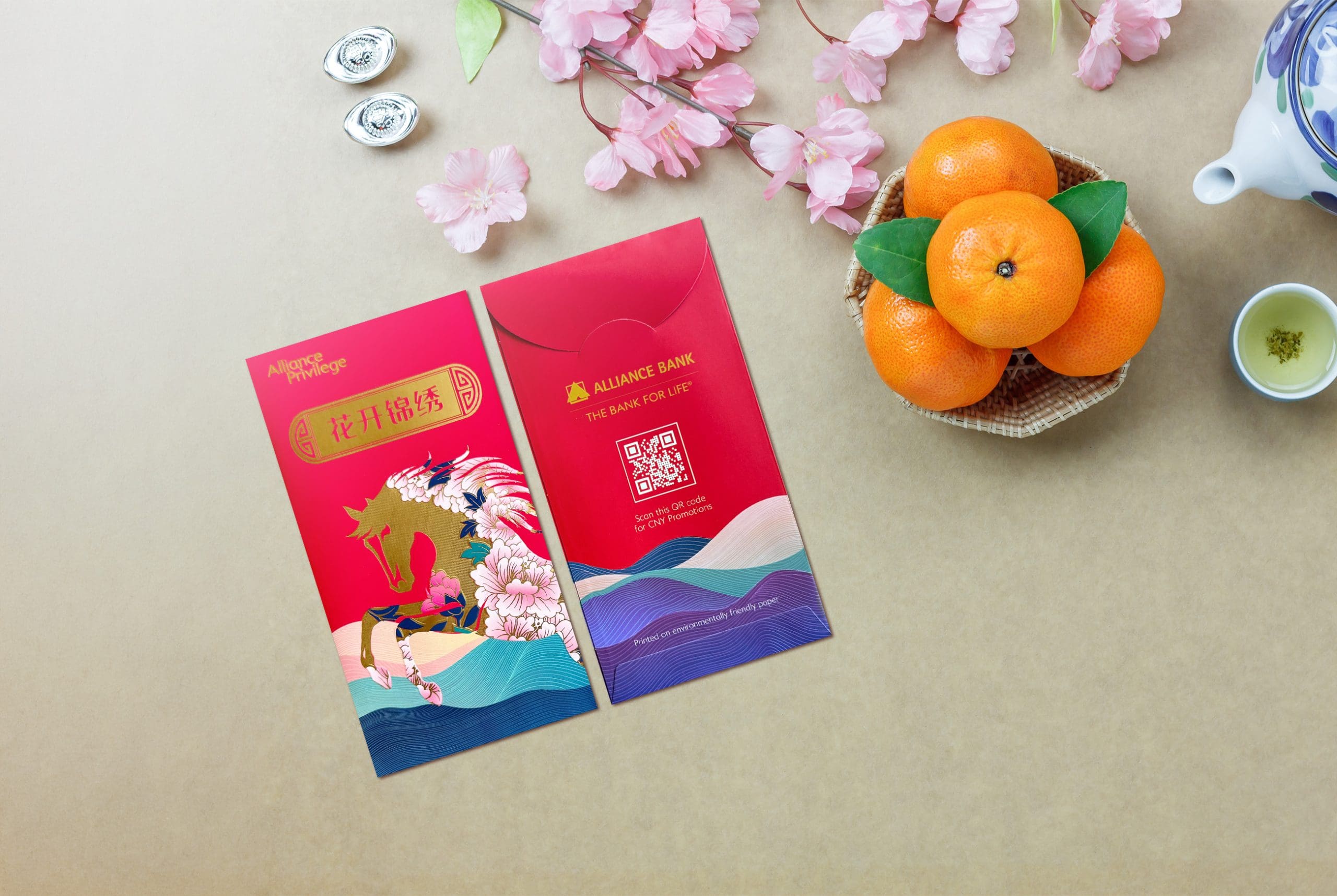
Alliance Bank
Okay. This one understood the assignment.
The Chinese phrase “骏马奔腾” translates to something like “the steed gallops vigorously” or “the horse surges forward,” symbolising momentum, success, and rising progress. Very on theme. Very Year of the Horse.
Visually, this is stunning. The horse is powerful, mid-rise, with intricate floral detailing woven into its body. It is not just a horse slapped onto red paper. The flowers blooming within the horse tie beautifully to prosperity and growth, and the layered wave patterns at the bottom add movement and depth.
And we have to appreciate the subtle inclusion of Alliance Bank’s signature blue woven into the design. Brand integration without being obnoxious. That is how you do it.
Detailed. Thoughtful. Powerful stance. Symbolic. Elegant but still festive.
This is galloping confidently at the front of the pack.
HAY or Neigh Scale: HAYYYY HAYYYY HAYYYY
Alliance Privilege
This variation carries a different phrase, “花开锦绣,” which roughly translates to “flowers bloom in splendid prosperity.” It ties directly to the floral-heavy design, which explains why the horse itself is intertwined with blossoms.
The storytelling is cohesive. The saying matches the visual. The flowers are not decorative filler. They are part of the message. The gold silhouette of the horse against the vibrant red background gives it a premium feel, while the layered wave details below keep the design dynamic.
It feels slightly softer and more refined compared to the main Alliance Bank version, but still very polished.
Beautiful, elegant, and thematically aligned.
HAY or Neigh Scale: HAYY
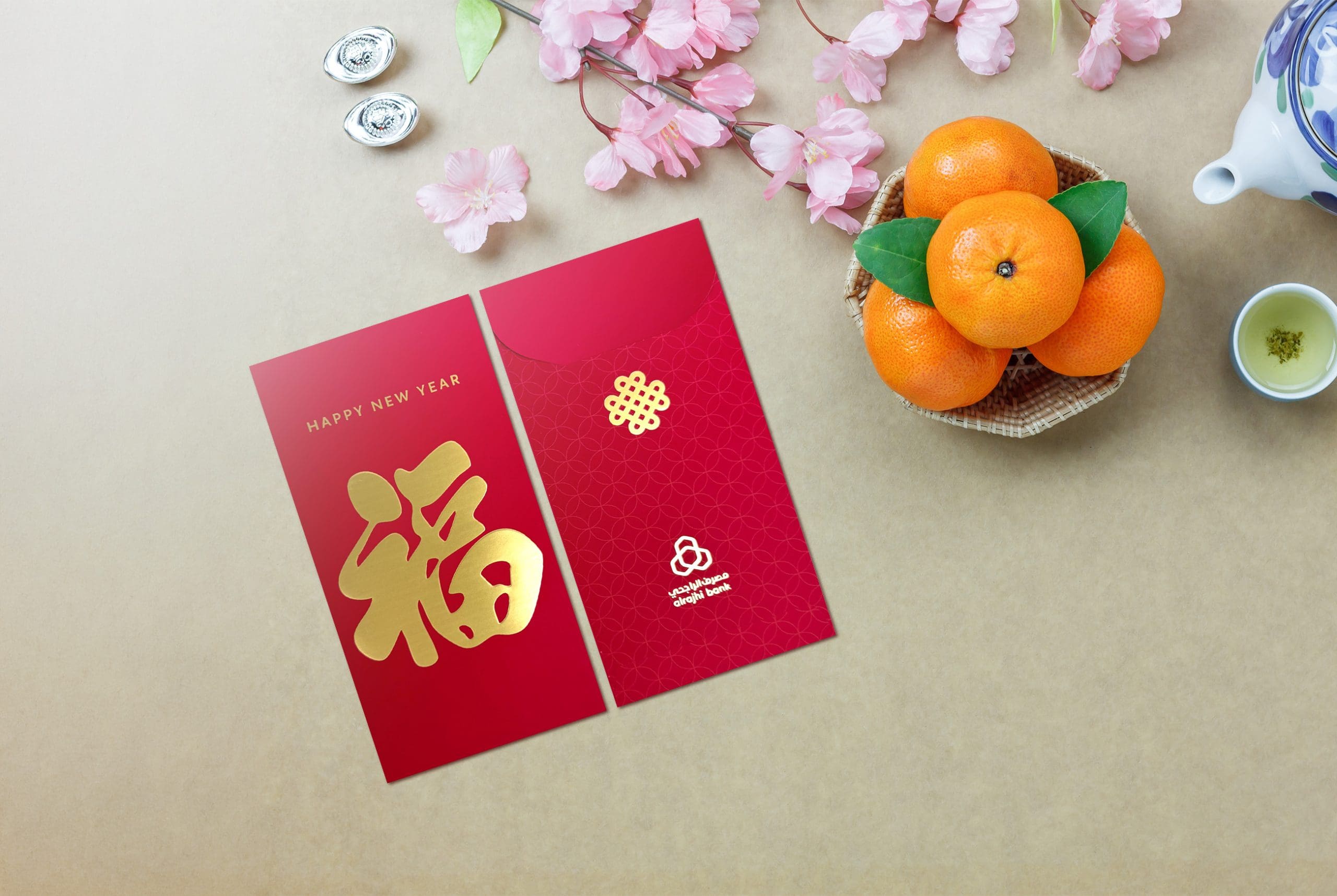
alrajhi Bank
This one is very straightforward. Large gold “福” character, clean red background, subtle patterned back. It is timeless and safe. You could use this any year and nobody would question it.
But because of that, it does not scream Year of the Horse. It whispers generic festive greeting. There is nothing wrong with it. It just does not gallop anywhere exciting.
Reliable. Practical. Low risk.
HAY or Neigh Scale: Neighhh
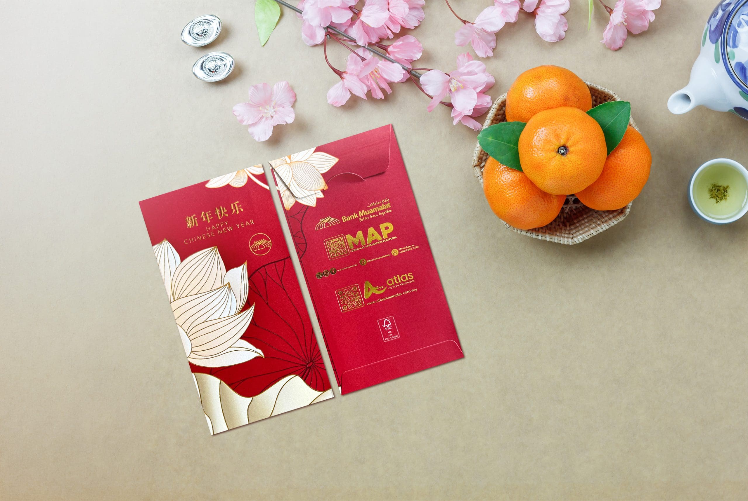
Bank Muamalat
Now this one is interesting. The geometric floral motif gives it a modern edge, and the gold-on-deep-red combination feels refined. It is different without being loud, which we appreciate.
The scalloped wave lines at the bottom are a very nice touch. They add texture and dimension, breaking up what could have been a very flat layout. It feels contemporary, almost like a designer stationery piece.
The only thing holding it back is the back of the envelope, which feels slightly crowded with QR codes, logos, and information. It shifts from elegant to promotional very quickly.
Still, points for effort and trying something different.
HAY or Neigh Scale: HAY
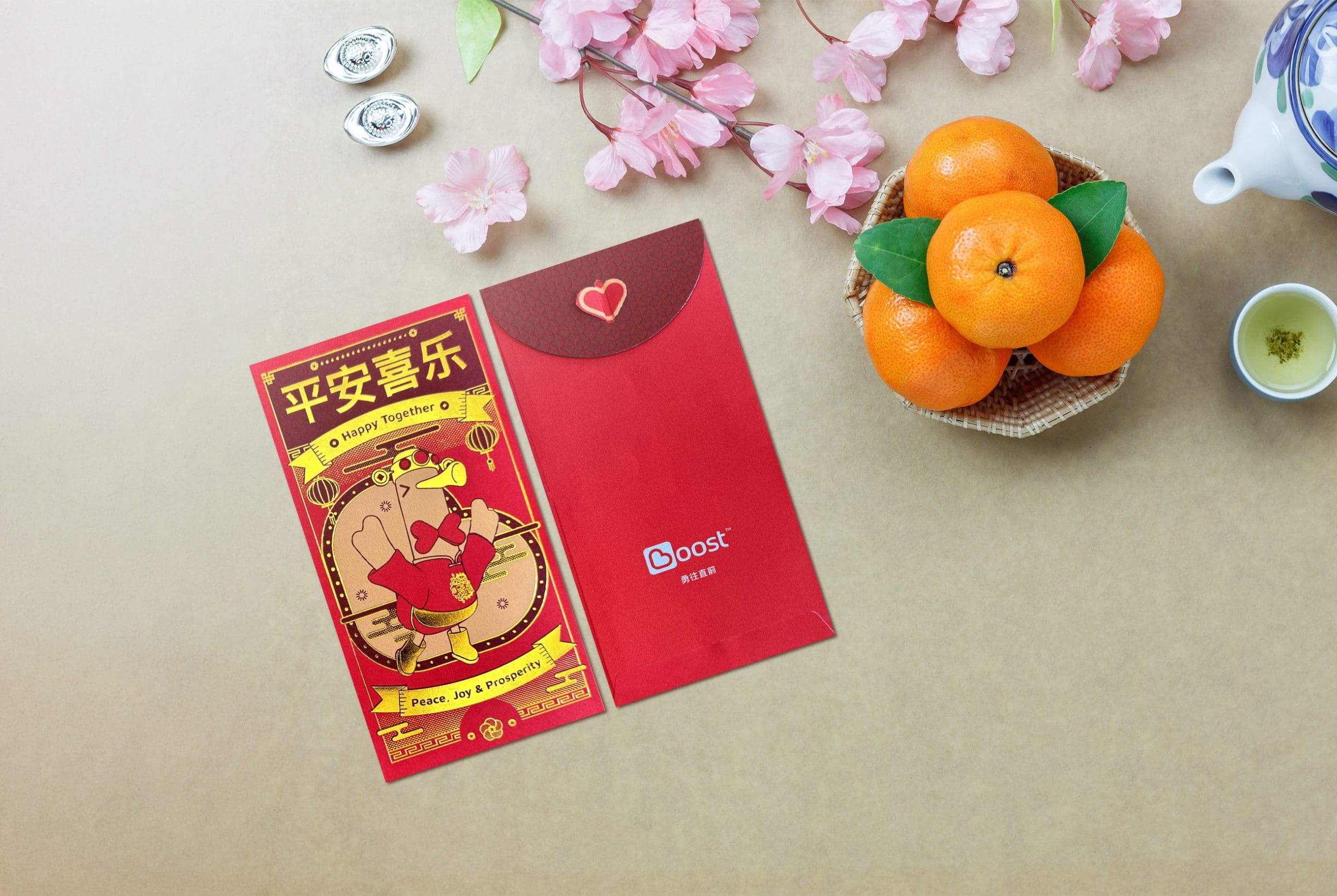
Boost Bank
Boost really leaned into personality this year.
Instead of a horse, they featured their mascot Bagoose in full festive attire, which is actually a smart move. Brand consistency done right. Bagoose is dressed up, energetic, and clearly celebrating, making the ang pow feel playful and fun.
Major points for including translated wishes like “Happy Together” and “Peace, Joy & Prosperity.” This makes it more inclusive for Malaysians who do not read Mandarin, which is honestly refreshing.
It is creative, cute, and very child-friendly. Also worth noting that there are multiple variations in the pack, so collectors might want to look out for them.
Not the most luxurious design, but definitely one of the most charming.
HAY or Neigh Scale: HAYYY
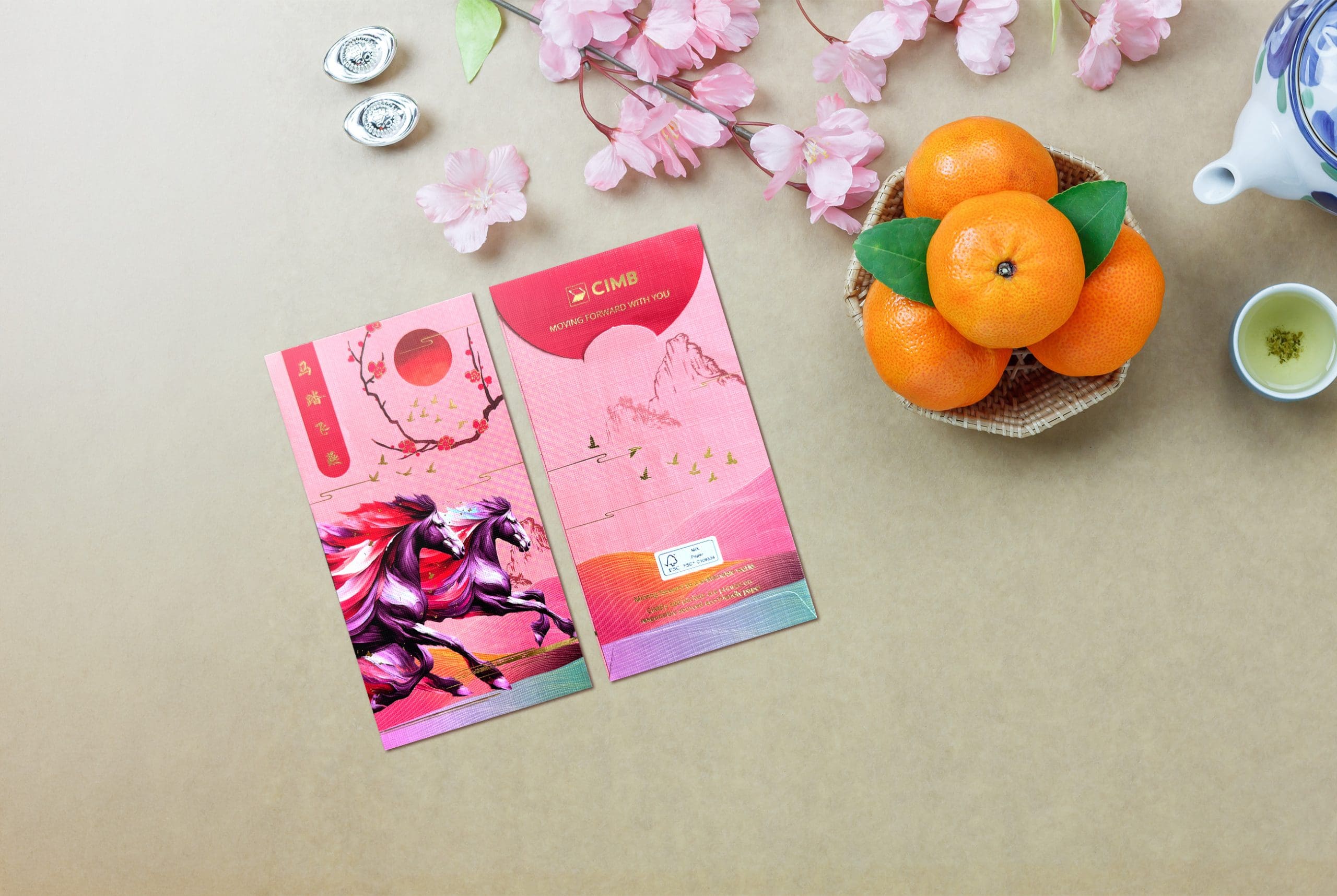
CIMB
CIMB came in with colour and movement. The twin horses running across a dreamy, almost neon landscape feel intentional and symbolic. Horses charging toward mountains often represent ambition and success, and the rising sun detail adds to that forward momentum theme.
The gradient rainbow tones at the bottom give it a modern twist, while the traditional elements like plum blossoms keep it grounded in festive symbolism.
It is bold, vibrant, and visually striking without feeling chaotic. The composition feels deliberate, not accidental.
Strong effort.
HAY or Neigh Scale: HAYYY
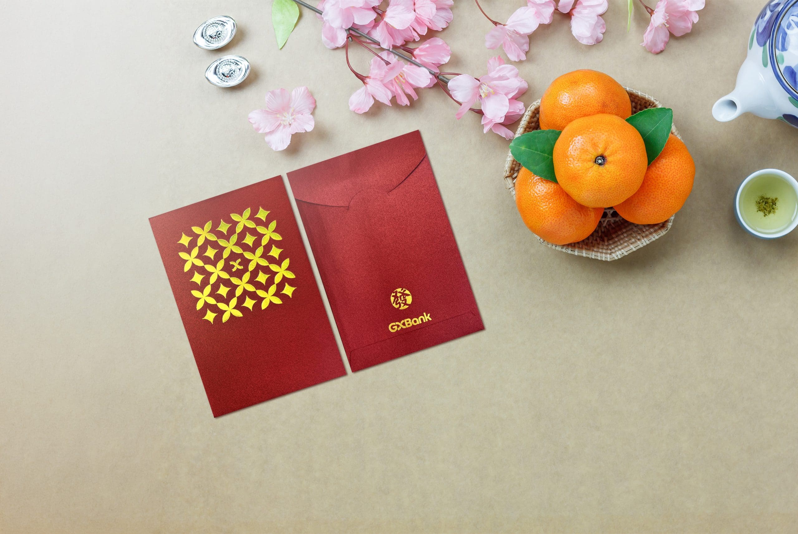
GXBank
GXBank went with a slightly shorter, more square-shaped envelope, which immediately makes it stand out in a stack. We like a little structural uniqueness.
Design-wise though, it leans very minimal. The gold circular motif is clean and symmetrical, but overall it feels similar to AEON Bank in that it is more corporate than celebratory. It could benefit from a little more festive storytelling or a Year of the Horse element.
Interesting shape. Safe design.
HAY or Neigh Scale: Neighhh
Hong Leong Bank
Hong Leong Bank went with a batik-inspired floral motif this year, and honestly, we appreciate the cultural crossover. The intricate florals feel very Malaysian, and it is nice to see local design elements blended into a Chinese New Year context. It gives the envelope a slightly more heritage feel rather than just another generic red-and-gold situation.
The ombré red background adds some depth and keeps it from looking flat, and the gold outlines help the flowers stand out nicely. It is not loud, not groundbreaking, but it is cohesive and pleasant to look at.
Safe, classic, culturally aware.
HAY or Neigh Scale: HAY
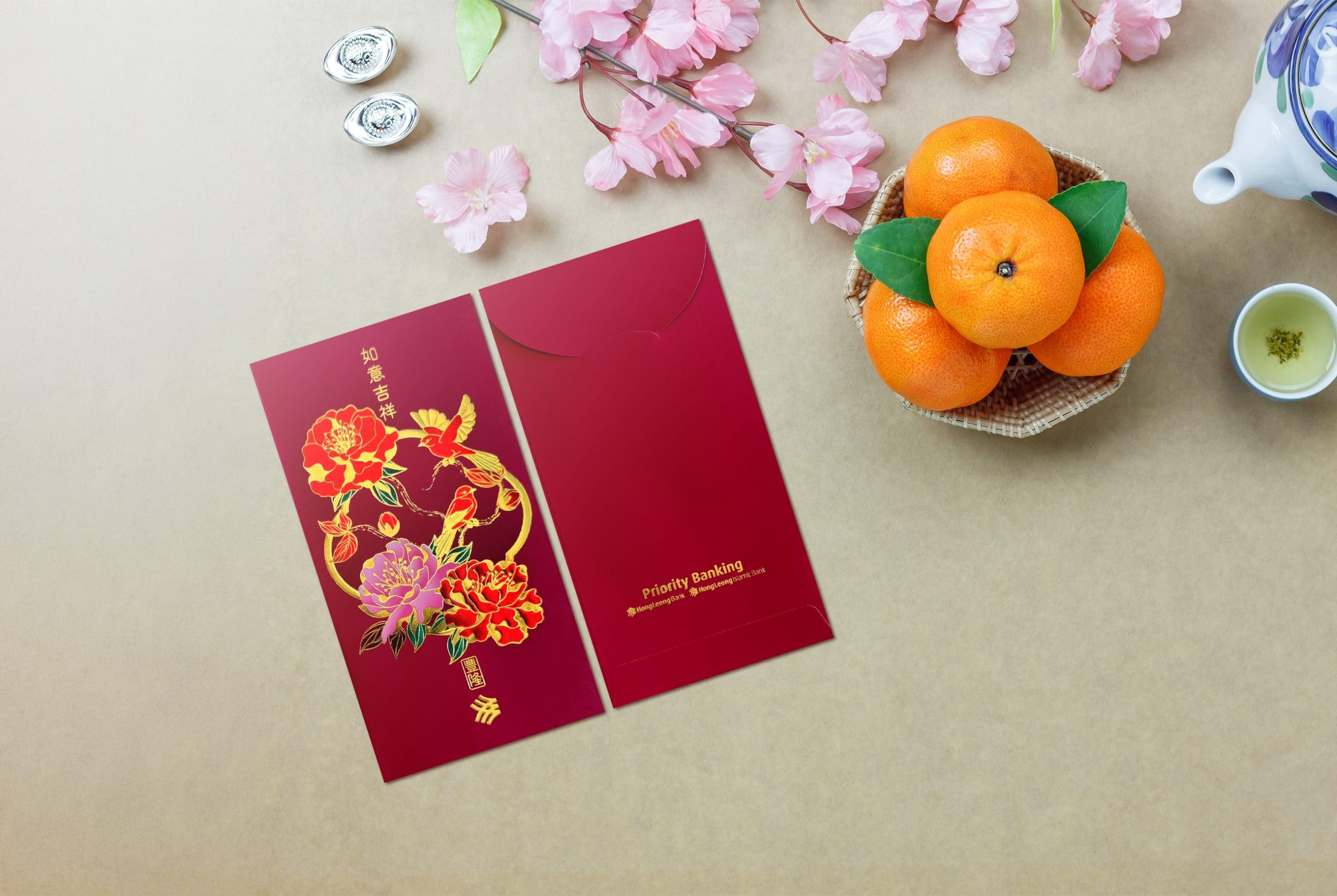
Hong Leong Bank Priority Banking
This one is elegant and refined, featuring detailed florals and birds arranged in a circular composition. The gold accents against the deep red background give it a premium, exclusive feel, which makes sense for a Priority Banking segment.
However, it feels like a variation of previous years rather than something newly inspired by the Year of the Horse. A different colour palette or a secondary variation within the same theme could have elevated it further.
Still beautiful. Just slightly predictable.
HAY or Neigh Scale: HAY
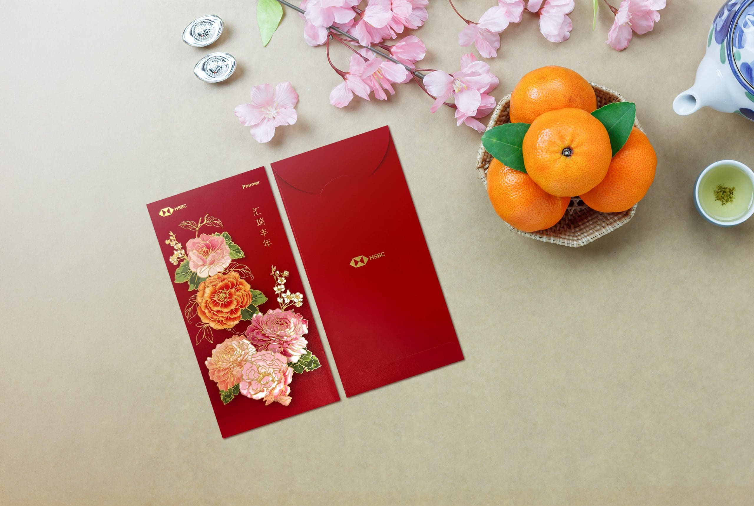
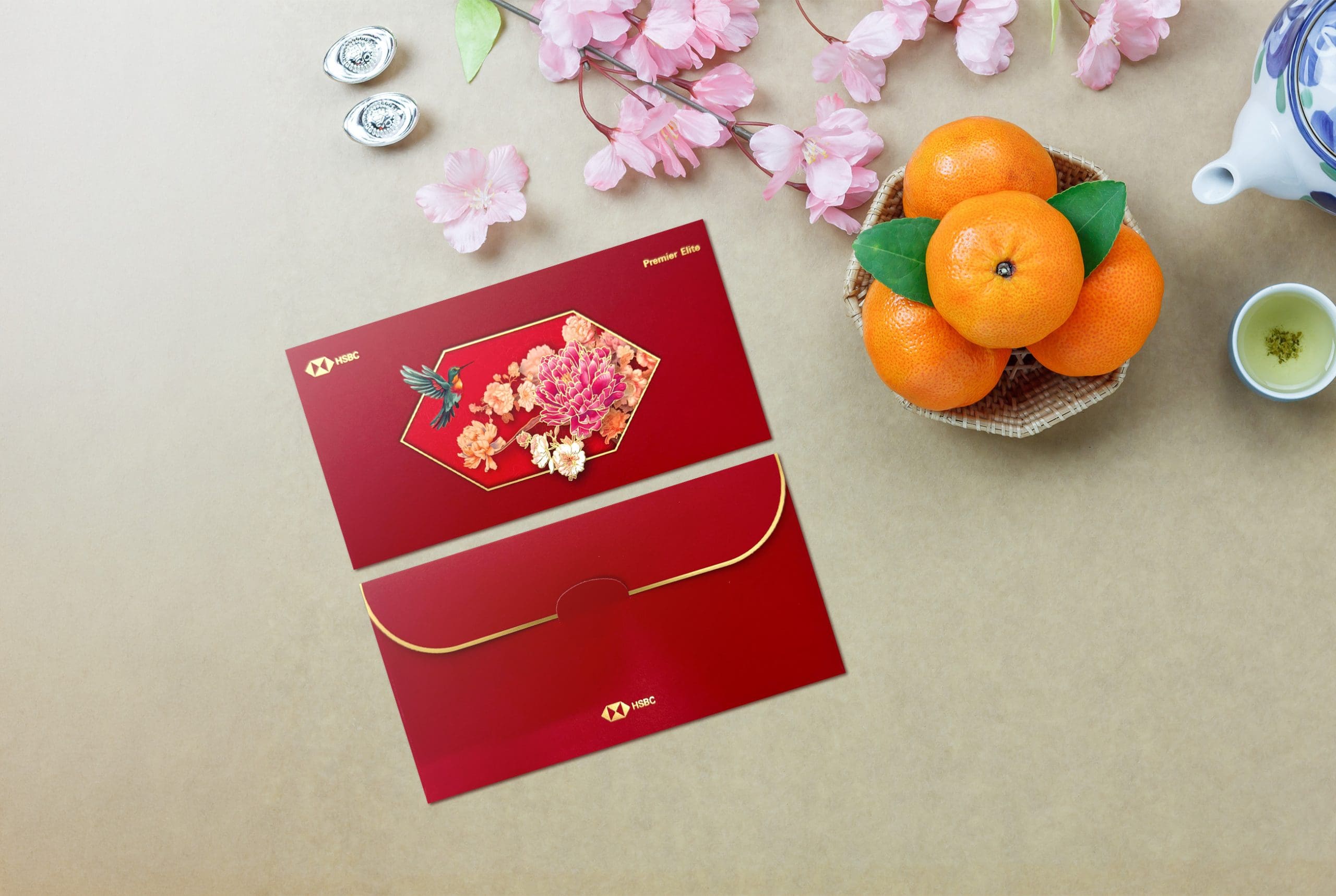
HSBC Premier
For something labelled “Premier,” this one feels surprisingly… restrained.
The florals are beautiful, yes. The illustration is delicate and elegant, and the gold accents are refined. But we have seen this formula before. Red background, floral cluster, logo placed politely at the top. It does not surprise us.
You would expect a Premier envelope to feel a little more elevated, maybe with a special texture, unique cut, or more distinctive Year of the Horse reference. Instead, it feels very standard issue festive.
Pretty, but playing it very safe.
HAY or Neigh Scale: Neighhh
HSBC Premier Elite
Now this is more like it.
First of all, the horizontal format immediately makes it feel exclusive. It stands out in a stack of vertical envelopes and instantly gives luxury vibes. The floral arrangement framed within the subtle HSBC hexagon outline is such a good detail. It is intentional branding without being loud.
Minimalist, chic, controlled. The negative space actually works in its favour. It feels curated rather than crowded.
For the Premier category, this is definitely the strongest execution. It whispers wealth instead of shouting it.
HAY or Neigh Scale: HAYYYY HAYYY
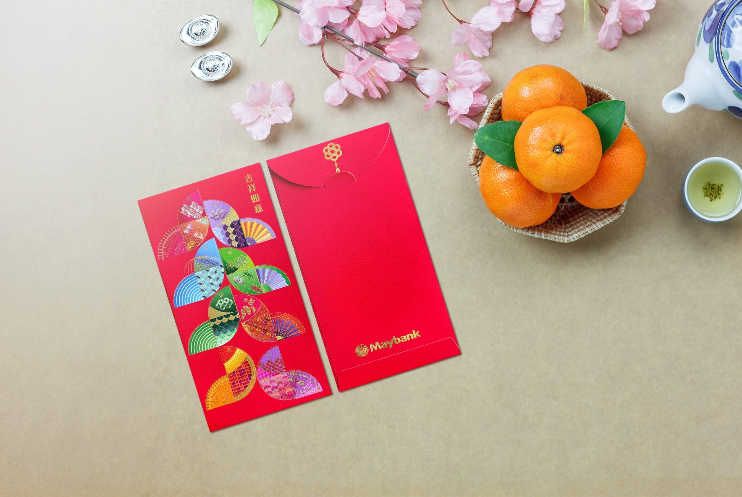
Maybank
Maybank went playful with a collage of colourful traditional fans, each with different patterns and textures. It is vibrant, cheerful, and visually busy in a good way. The mix of motifs makes it interesting to look at.
The colour choices are especially fun. You could almost convince yourself the fans are subtly inspired by Malaysian ringgit notes. Purple, blue, green, red, orange. A very subliminal “hope there is matching colour money inside” moment.
It is cute and lively, but it could have pushed the festive storytelling a bit further. Maybe a horse silhouette hidden among the fans? Something extra to tie it specifically to 2026.
Still, very charming.
HAY or Neigh Scale: HAY
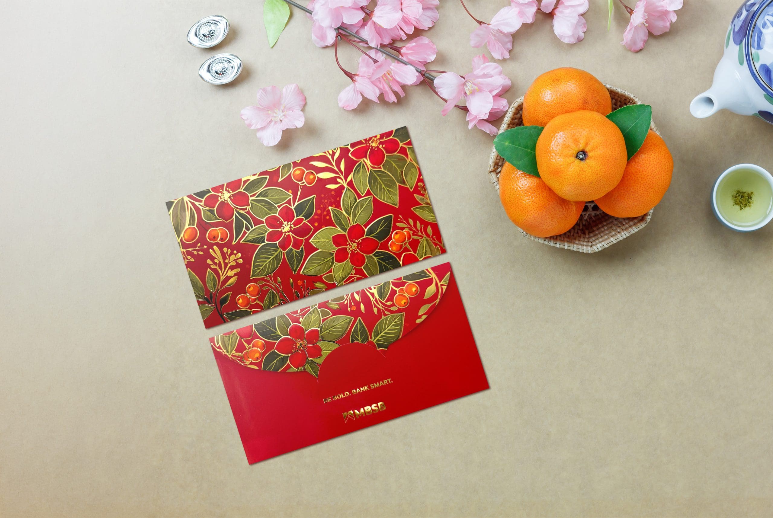
MBSB
This one leans heavily into floral elegance, but it does not immediately scream Chinese New Year. If someone handed this to you in the middle of the year, you probably would not question it.
The botanical pattern is nice, the colours are warm, but it feels more like a lifestyle stationery envelope than a festive ang pow. It is not bad, just missing that celebratory punch.
Usable. Practical. A little too everyday.
HAY or Neigh Scale: Neighhh
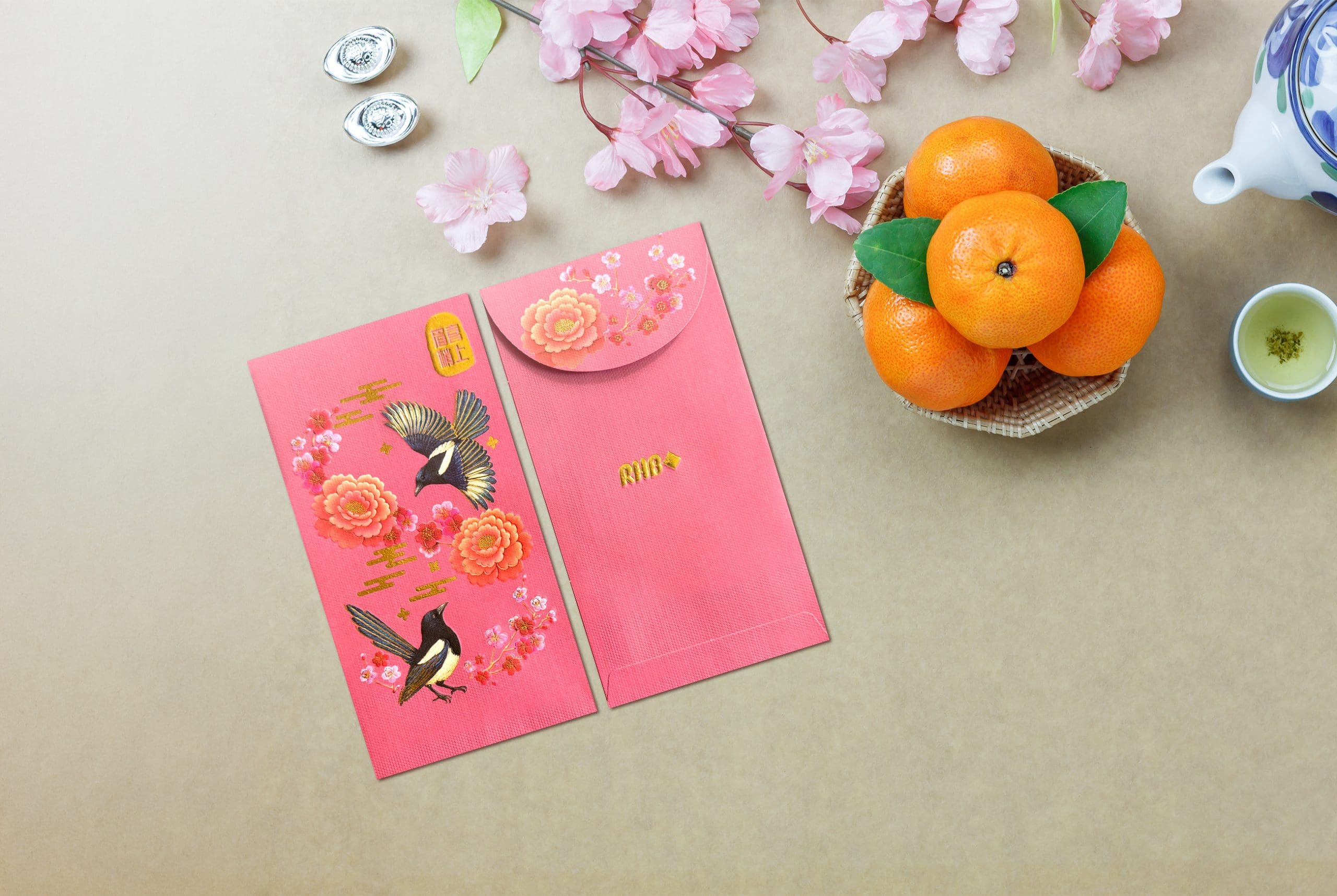
RHB
RHB really nailed the festive energy this year. The colours are vivid and bright, immediately standing out in a stack of envelopes. The embroidery-inspired detailing gives the design a rich, almost fabric-like texture, making it feel more premium than a standard print.
The sparrows are beautifully illustrated with fine, painterly details in the feathers and florals, which adds depth and dimension to the overall composition. Even without featuring a horse, it still captures the spirit of Chinese New Year perfectly through its bold red tones and intricate gold accents.
It is vibrant, elegant, and genuinely very pretty.
HAY or Neigh Scale: HAYYYY HAYYYY
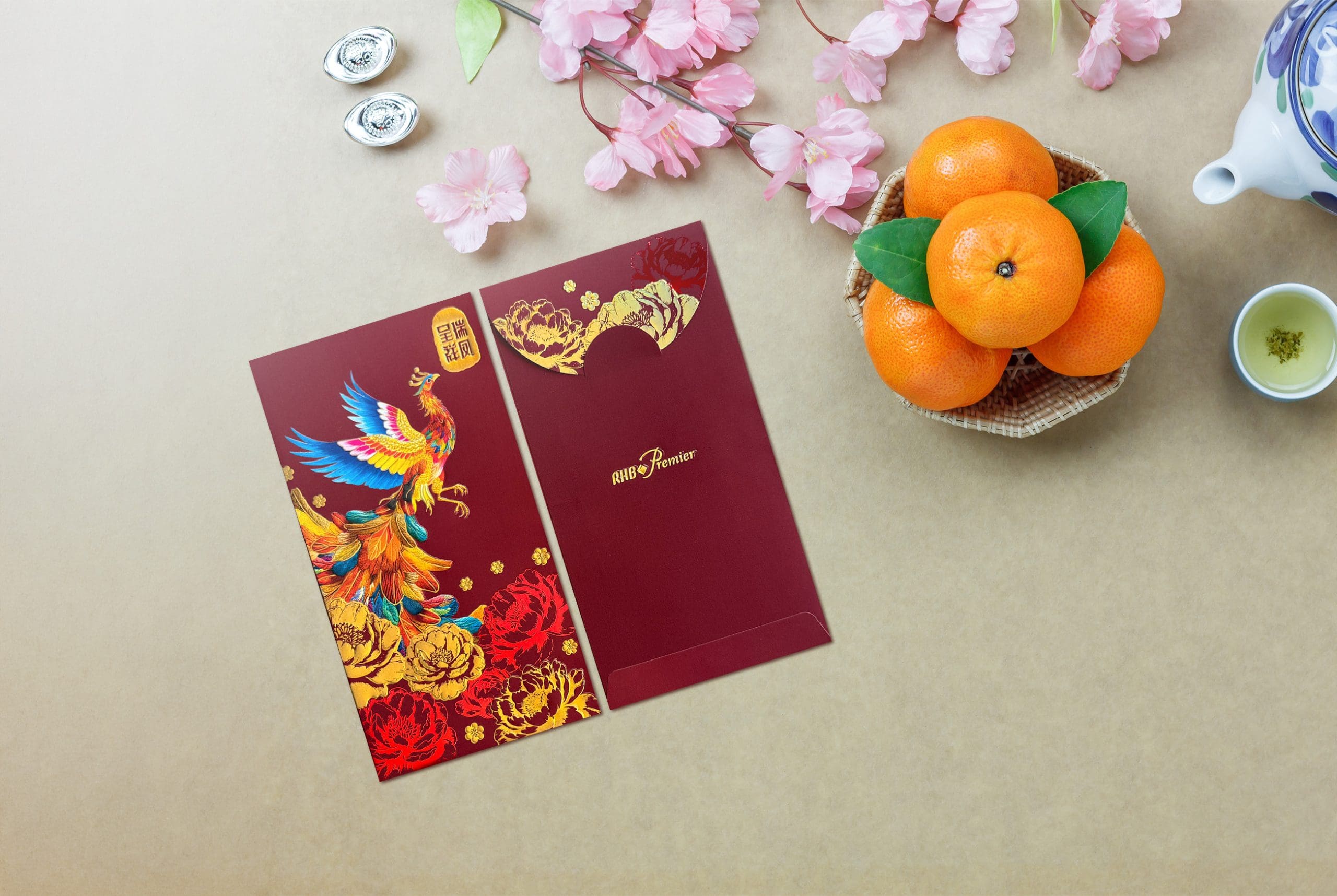
RHB Premier
The Premier version takes a slightly more understated approach. The phoenix remains the hero, but the overall palette is softer and more controlled. It feels elegant and refined, very much targeted at the “quiet luxury” crowd.
The florals are beautifully illustrated and the composition is balanced, but it does play things a little safe. You can tell it is meant to be classy rather than loud.
Chic. Elegant. Slightly reserved.
HAY or Neigh Scale: HAYYY
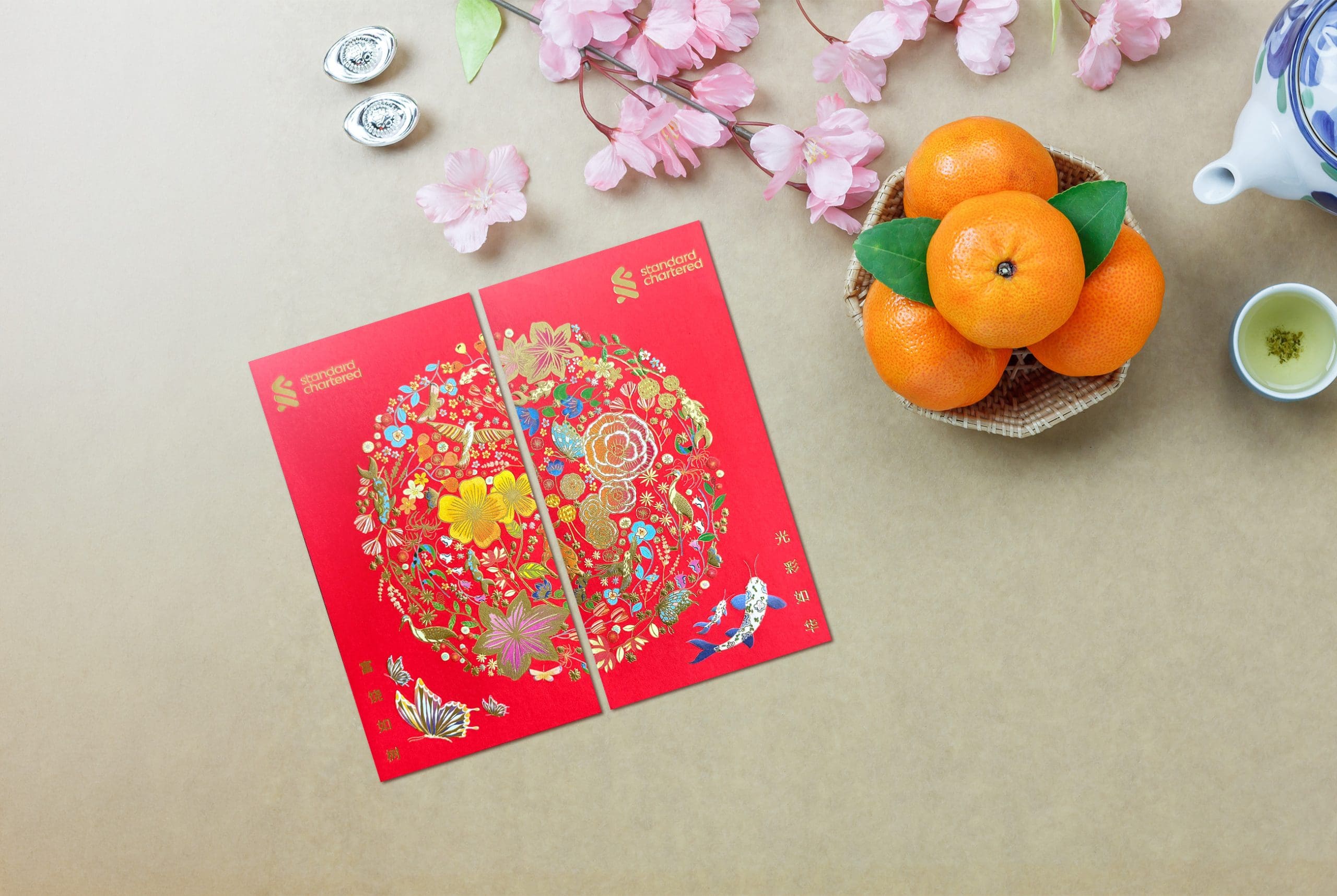
Standard Chartered
This one is colourful and intricate, featuring a large circular composition filled with florals, butterflies, koi fish, and various symbolic elements. There is a lot happening.
It is not bad, but it does feel slightly messy because of how many motifs are packed into the circle. It could easily double as a wedding envelope or a general celebration envelope rather than something specifically tied to Chinese New Year.
Nice effort, but the theme feels diluted.
HAY or Neigh Scale: HAY
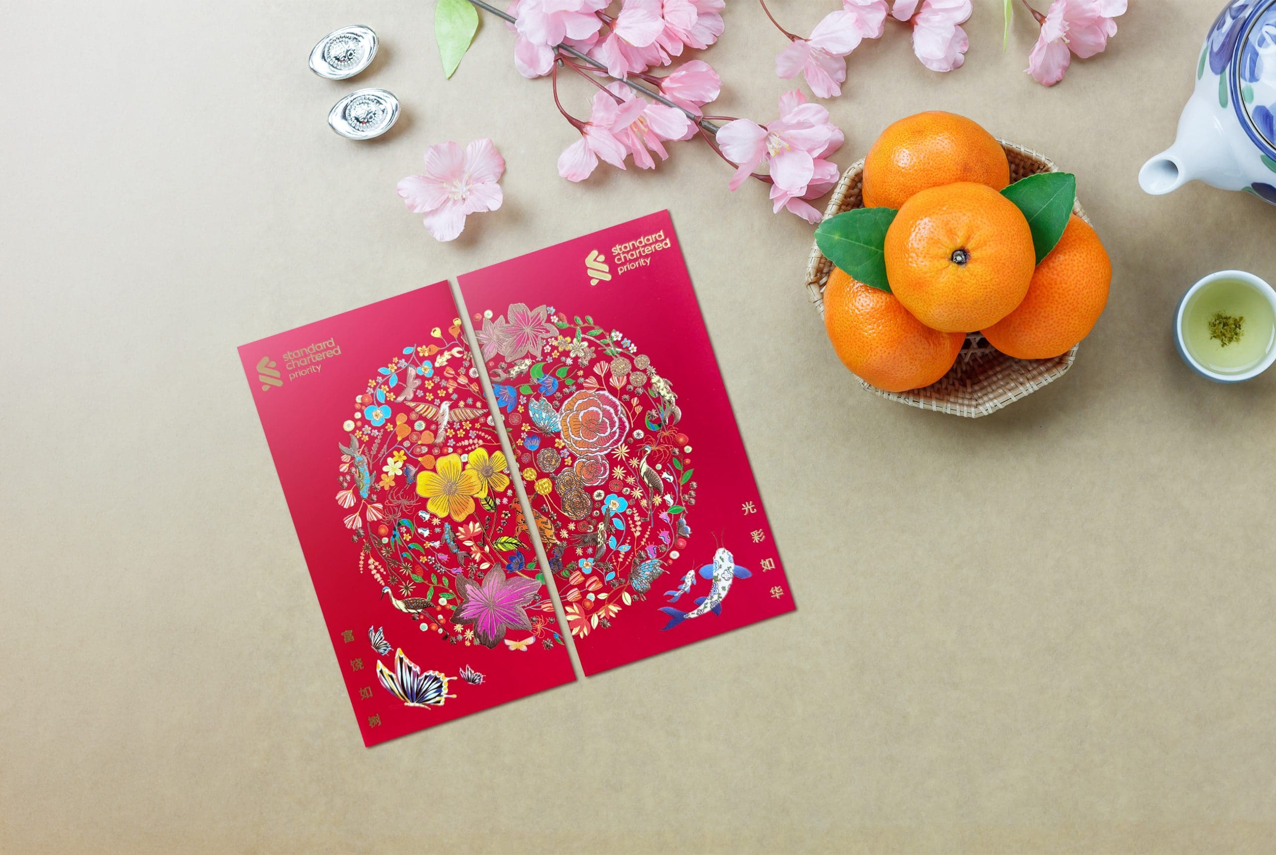
Standard Chartered Priority
Very similar to the main variation, just slightly more polished in placement and branding. The same busy circular composition carries over, so the same comments apply.
Still pretty. Still a bit crowded. Still not strongly Year of the Horse.
HAY or Neigh Scale: HAY
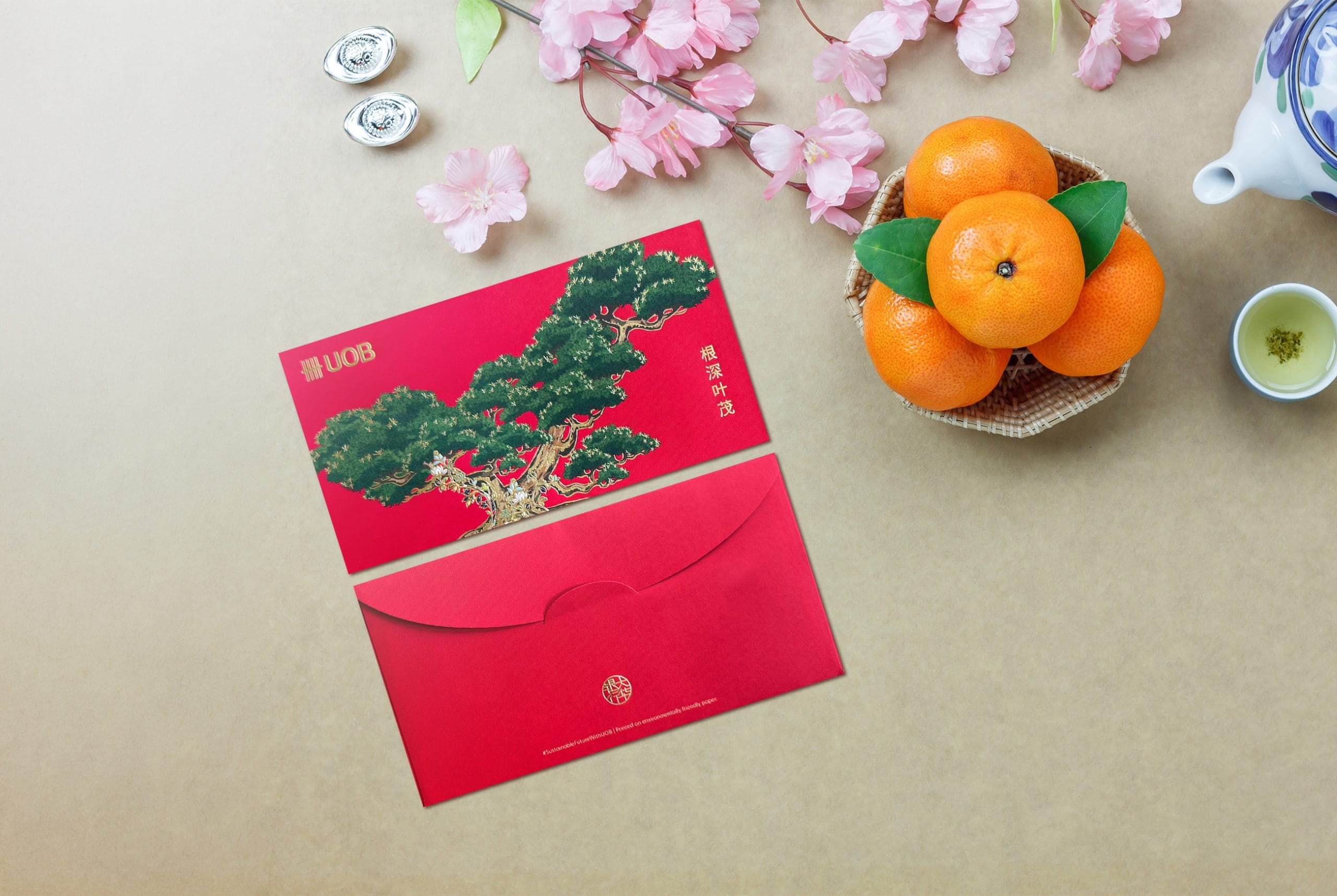
UOB
UOB chose a strong tree motif alongside the phrase “根深叶茂,” which means “deep roots and flourishing leaves,” a blessing that represents stability, resilience, and abundant growth. The symbolism works beautifully. A strong foundation leading to growth and prosperity. That concept ties nicely to the sturdy tree illustration.
The artwork is detailed and elegant, but it feels more corporate prosperity than festive celebration. It is meaningful, yes, but slightly lacking in obvious Chinese New Year cues.
Maybe if it leaned into something more seasonal like turning it into an orange tree or adding more celebratory elements, it would feel warmer and more festive.
Before anyone starts drafting strongly worded emails, a gentle reminder that the HAY or Neigh Scale is completely made up, mildly dramatic, and absolutely not recognised by any financial authority.
At the end of the day, no matter how many Y’s or H’s we give, what truly counts is what goes inside the ang pow. A simple envelope with generous blessings will always outrun the fanciest design.
Now we want to hear from you. Which bank galloped straight into your heart this year? Which one deserves more Y’s? Drop your favourites in the comments and let the festive debate begin!
From all of us at RinggitPlus, may your Year of the Horse be filled with strong momentum, smooth journeys, overflowing prosperity, and just the right amount of dramatic Hayyyyy energy.
Samuel writes about personal finance and financial news, focusing on how banking updates, policies, and promotions affect everyday money decisions. He enjoys making complicated financial topics easier to follow. Outside of writing, he spends his time watching TV shows and occasionally convincing himself he will only watch one episode.
54votes
Article Rating
SHARE
About THE AUTHOR
Samuel Chua
Samuel Chua
Samuel writes about personal finance and financial news, focusing on how banking updates, policies, and promotions affect everyday money decisions. He enjoys making complicated financial topics easier to follow. Outside of writing, he spends his time watching TV shows and occasionally convincing himself he will only watch one episode.
Subscribe to our exclusive weekly newsletter and we’ll bring you the week’s highlights of financial news, expert tips, guides, and the latest credit card and e-wallet deals.
Thank you for subscribing!
Stay tuned for what’s to come next in the personal finance world


Comments (2)
I prefer the Huatmeter! Please bring back the HUATmeter energy!!!
akak rasa you know which is the most HAAAYYYYYY!!! :(((((((((((((((((((((