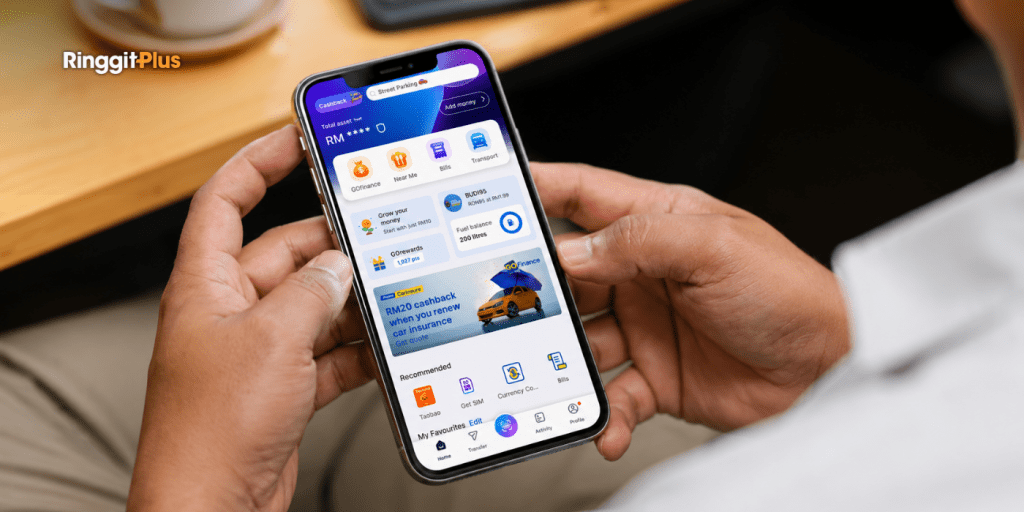
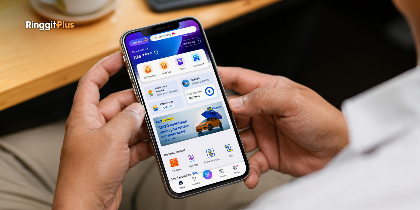
Touch ‘n Go (TNG) eWallet has redesigned its homepage to put its most-used services on the front screen, with the new layout reaching users from 4 June 2026. The change means you no longer have to move through several menus to reach key functions.
TNG Digital, which operates the app, announced the change at a media briefing at its Bangsar South office. It described the new layout as a response to how people now use the app rather than a cosmetic refresh.
GOfinance, Bills, Transport and Near Me Lead the Layout
GOfinance covers financial services, Bills handles utility and recurring payments, Transport covers commuting and travel, and Near Me surfaces nearby food and beverage deals.
The bottom navigation bar has also been reorganised around the features people use most, with a focus on one-handed operation. That reflects how most people hold their phone while paying at a counter or checking a balance on the move.
From a Payments App to an Everyday Tool
Chief executive officer Alan Ni said the redesign reflects how the app has moved beyond payments into something people use across different parts of daily life, from growing their money and travelling overseas to paying bills and earning rewards.
That shift shows up in the numbers. Ni said half of the company’s revenue now comes from services other than payments, while cross-border, remittance, and international services make up about 10% of total revenue, up from almost nothing a few years ago.
TNG eWallet currently has more than 26 million verified users, including 13.5 million monthly active users in Malaysia, who open the app an average of twice a day. Ni pushed back on the common description of the app as a “super app”, saying he’d rather it be seen as an everyday digital companion. Like Grab, it has become a Utility for many of us.
The Change Focuses On Navigation, Not New Features
For now, the update rearranges existing services rather than adding new ones, so the immediate difference is where things sit, not what the app can do. Regular users, who open the app twice a day on average, will find their most-used buttons in new places.
For tap-to-pay, it’s mostly the scan and reload buttons that move. For anyone who also parks money in GO+, sends remittance, or pays bills through it, those features now sit grouped under one hub each rather than spread across the home screen.
Chief product and growth officer Chiew Wei Wing said this redesign is the start of a longer set of changes, with the app eventually recognising individual users and suggesting services based on their spending and needs at a given moment. That personalisation is still to come later this year.
Follow us on our official WhatsApp channel for the latest money tips and updates.
Christina writes about personal finance with an eye for making the complicated feel straightforward. She is drawn to the everyday money decisions people face and genuinely enjoys finding the clearest way to explain them. Between articles, she is probably napping, on a hiking trail, or terrorising her sister’s cats.
00votes
Article Rating
SHARE
About THE AUTHOR
Christina Chandra
Christina Chandra
Christina writes about personal finance with an eye for making the complicated feel straightforward. She is drawn to the everyday money decisions people face and genuinely enjoys finding the clearest way to explain them. Between articles, she is probably napping, on a hiking trail, or terrorising her sister's cats.
Subscribe to our exclusive weekly newsletter and we’ll bring you the week’s highlights of financial news, expert tips, guides, and the latest credit card and e-wallet deals.
Thank you for subscribing!
Stay tuned for what’s to come next in the personal finance world


Comments (0)